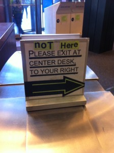
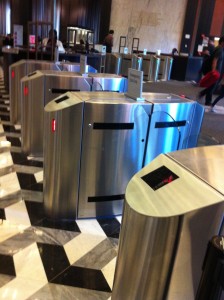
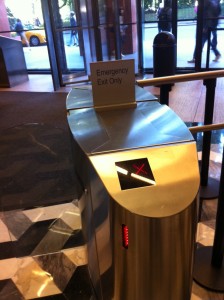
The TAP ‘n Go is an interactive entry/exit system for the Bobst Library. I became aware of this system the first time I approached the glass doors guarding the library entrance.
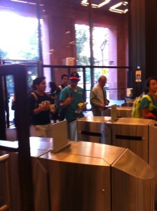
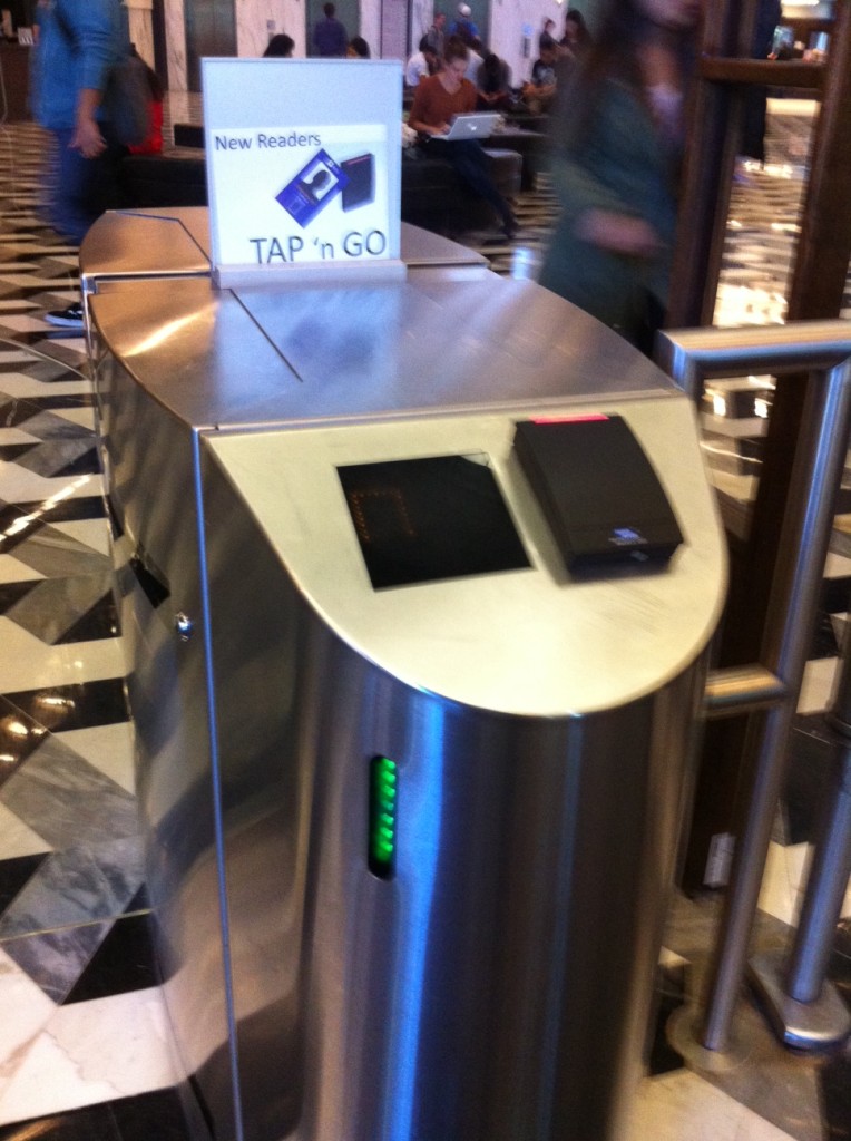
The sign that said “New Readers” was not relevant to me because I had never been here before to see the old system. But the name “Tap ‘n Go” and the image of a card was helpful because I understood that I could open the glass doors by using my card. It was not immediately clear which set of sliding doors would open (to my right or left) but I learned by following other people as they used the system.
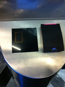
The yellow square on the front screen turns into an arrow that points in the direction of the glass doors you have just opened. The red light above the card scanner turns green as well, and a soft tone indicates that you may now enter. The green horizontal lightstrip on the side of each unit indicates that this is an entrypoint.
Once you are inside, the interface is reversed. The corresponding horizontal lightstrip is now red (instead of green) to indicate that this is not an exit. The yellow square is now a red X. There is no card reader. The signs say things like “Emergency Exit Only” and “Not Here.” If you try to exit through a Tap ‘n Go, there is a long, loud, sustained tone.
The proper place to exit is a scanner to ensure that nobody leaves the premises with unchecked library books. When somebody does, there are eight short tones to indicate an alarm going off, and the person guarding the entrance will inspect your bag.
My first interaction with the Tap ‘n Go was very confusing. I watched other people use it to get an idea of what to do (scan my ID card), and which set of glass doors would open. But when I scanned my card, I got a green circle instead of an arrow and the doors did not open. I tried a few times at a few different card readers and finally made my way to the security desk where I was told “this happens” and to call Card Services. I called and explained the situation, my card was activated, the yellow square turned into a green arrow, the glass doors slid open, and I entered the Bobst Library.
I observed a similar encounter this afternoon. A woman wearing headphones tapped her card, and proceeded to walk towards the set of glass doors that had opened for the previous person to use that card reader. The doors did not open. Frustrated, she backed up and tried the same reader again. No opening. Shaking her head, she tried the adjacent card reader. Same result. And again and again, until she finally made her way to the security desk and had the same phone call with Card Services that I had had. During this time, she listened to headphones and read a book in the lobbyish area between the Tap ‘n Go system and the revolving glass doors facing the street. I asked her to show me what happens when she scans her card, but by this time, her card had been activated, so she followed the green arrow into the library.
This was the longest interaction I observed with the Tap ‘n Go. Other lengthy interactions included people who experienced a “hiccup” where their card did not read on the first try. These people tended to be doing something else while scanning their card, and I’m not sure whether their interface beeped at them or if they simply heard a tone from an adjacent interface. Most of the interactions were very short.
This design makes use of some of Norman’s Principles of Design—it takes shapes we are familiar with and we understand intuitively that the glass doors will open if we swipe a card over the black surface. But there is not visibility to the set of possible actions. To the user, there can only be two results—the card is read and the doors open, or the card is not read and something is broken. When there is a response—either a tone or an image changing from a yellow square to green circle— but the door does not open, this doesn’t provide enough feedback to the user about what is happening.
Chris Crawford defines interaction as an iterative cycle in which two actors listen, think, and speak. In most cases, the Tap ‘n Go interaction cycle only happens once: it hears a card scan, it thinks, and communicates the results with open glass doors. However, this everyday object lacks “interestingness” in its thought process, and also lacks clear communication in cases when an irregular result occurs. Crawford advocates for interactivity as a means for sustained engagement, but sustained engagement is not desirable for anybody who interacts with the Tap ‘n Go.
