I scored 19 on my Color Test, which isn’t perfect but hey, it’s not so bad. Actually it’s great! I had always thought I was color blind because I took a test at the doctor once where I was supposed to say which was the letter L was pointing, and I didn’t see the letter, it just looked like a magic eye. Turns out I’m just no good at magic eyes!
For my Color Composition, my first thought was to draw inspiration from abstract geometric artists like Piet Mondrian and Kazmir Malevich, because I love the way that these very minimal compositions use color, like this. It’s interesting to think about what kind of approach these artists might have taken if they had computers at their disposal, let alone tools like processing. Maybe they would have created a system that automatically generates a random composition according to a few sets of rules. Maybe they would have animated their paintings (there are some great examples of this). But after getting bogged down in the math of pixel coordinates and making something that I was not so pleased with, I decided to put this idea aside for now.
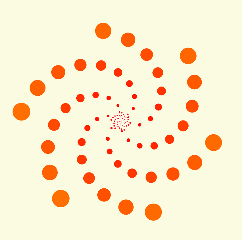
I used Processing to create an animated geometric composition that changes one aspect of its color depending on the position of your mouse. There are three variations:
HUE – The circles are all monochrome colors within a range of 30 on the 360 scale. The range changes depending on the mouseX position. If you click the mouse then the hue of the inner ‘ring’ is offset by 30. So one click gives you analogous colors vs the outer ring. Four clicks gets you 2/3 of a triad. Six gets you in a complementary range and so forth. Meanwhile, the mouseY position controls the brightness of the background, which is a desaturated yellow at its brightest (attempting to emulate the color of a canvas), and nearly black at its darkest. The hues feels very different depending on the brightness of the background.
SATURATION – in this version, mouseX controls the saturation instead of the hue. I stuck with a fixed brightness in the background to really see the difference, but mouseY instead impacts the saturation of the background. Clicking changes the inner ring’s color range.
BRIGHTNESS – Now, mouseX controls the inner ring’s color range. When the colors are very dark, you realize that the background was not as black as it seemed, and can really see the difference between the saturated background (mouseY towards the bottom) vs the desaturated (mouseY towards the top).

