Tangible Interactions

To determine the actual amount of time it will take to make something, consider the rule of pi: multiply how long you think it will take by pi (3.14). This rule of pi is surprisingly accurate.

-Dustyn Roberts, Making Things Move

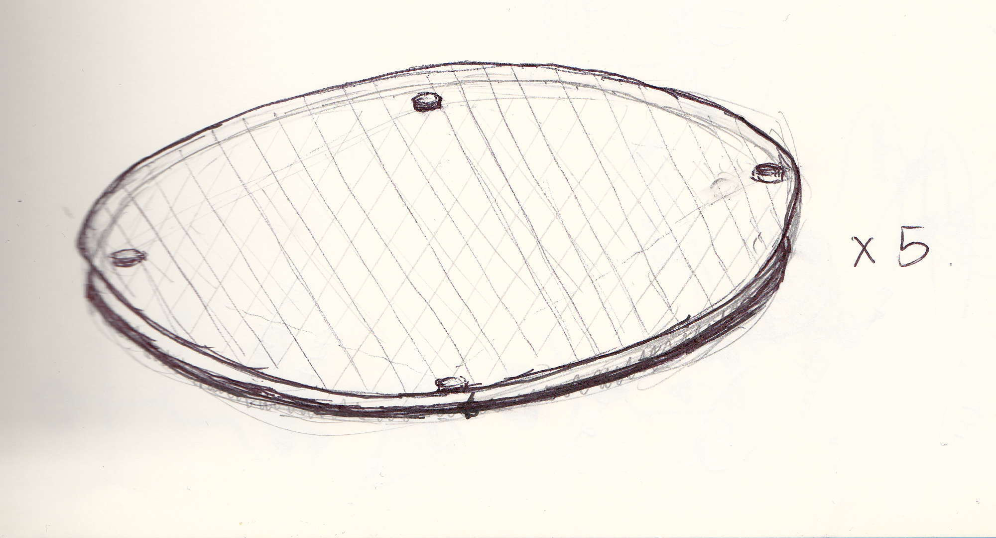
Yiyang and I made some good progress on our midterm project this week. We picked up a couple square-ish pieces of clear acrylic, at 3/8″ thick which we think will be the thickest possible for laser cutting. They are smaller than our initial concept, but it is helpful to test out the interaction. We used the drillpress to drill space for an RGB LED. Then we sandwiched sensors in between the acrylic pieces, supported by rubber feet, and tested the Arduino program to see what types of readings we were getting and get the light working in a nice way. We feel that the light and its slow decay is a very important part of the interaction because its decay will mimic the sound that the action produces.

First we tried a piezo from Radio Shack (above) but that sensor was too thick. Then, after it arrived in the mail from adafruit, we tried a force-sensing resistor, but that was not giving us a reading for some reason. Maybe we’ll come back to FSR’s later. But the best sensor so far was a flat round piezo that was working really well and also triggering the sound we want it to trigger.

We’re thinking to build a few drum pads for now, with the longer term goal of working towards a ‘step sequencer.’

Working with actual materials, sensors and code to make this prototype is really helpful for me. From here, we need to figure out a good way to keep the two pieces of acrylic together. We need flat rubber feet rather than rounded because they’ll be easier to stack. We need to find the best position for the sensor that will keep it insulated from vibration of the floor surrounding it (this was a problem until we moved the sensor to the middle of the acrylic sandwich—maybe we need multiple sensors in parallel? We’ll see). A lot will depend on the size we settle on for our acrylic pads. I think that the size we’ve been working with, roughly 5″x5″, is pretty nice, but originally we’d hoped to have bigger pads. If we do work with bigger pads we might need additional sensors to pick up the same force no matter where the user steps—this already impacts the sensor reading.

A big part of our project is the look and feel. I think the wires and sensors would look cool sandwiched between two pieces of acrylic, maybe we can drill a hole in the center of the bottom piece to pass everything through from the ground below. One way or another we’ll need to tidy and/or hide all of the electronics so that the user can focus on the sound, the light, and the feeling of dancing without worrying that they’re stepping on something that might break (hopefully it’ll be sturdy, too!).

I have been thinking about interactions in ways I had never considered.

Particle Systems, PVectors, Simulation

For this ICM assignment, I tried to incorporate a bunch of the concepts that have come up in class recently and also some Nature of Code stuff that I really wanted to wrap my head around. These include ArrayList, Polymorphism, Inheritance, Perlin Noise, Particle Systems, oscillation and physics simulation. I messed around with the physics engine Box2D over the summer and thought it was cool but I’d rather do physics on my own terms so I made my own version of forces like gravity. This sketch is a work in progress but was fun to organize everything into ArrayLists of ArrayLists and I’m glad I was able to wrap my head around the structure.

Screen Shot 2013-10-22 at 3.10.23 AM

unfortunately this didn’t translate well in javascript mode but here’s source code on Github.

Color Composition

I scored 19 on my Color Test, which isn’t perfect but hey, it’s not so bad. Actually it’s great! I had always thought I was color blind because I took a test at the doctor once where I was supposed to say which was the letter L was pointing, and I didn’t see the letter, it just looked like a magic eye. Turns out I’m just no good at magic eyes!

Screen Shot 2013-10-18 at 1.34.30 AM


For my Color Composition, my first thought was to draw inspiration from abstract geometric artists like Piet Mondrian and Kazmir Malevich, because I love the way that these very minimal compositions use color, like this. It’s interesting to think about what kind of approach these artists might have taken if they had computers at their disposal, let alone tools like processing. Maybe they would have created a system that automatically generates a random composition according to a few sets of rules. Maybe they would have animated their paintings (there are some great examples of this). But after getting bogged down in the math of pixel coordinates and making something that I was not so pleased with, I decided to put this idea aside for now.

I used Processing to create an animated geometric composition that changes one aspect of its color depending on the position of your mouse. There are three variations:

Screen Shot 2013-10-18 at 11.14.35 AM

HUE – The circles are all monochrome colors within a range of 30 on the 360 scale. The range changes depending on the mouseX position. If you click the mouse then the hue of the inner ‘ring’ is offset by 30. So one click gives you analogous colors vs the outer ring. Four clicks gets you 2/3 of a triad. Six gets you in a complementary range and so forth. Meanwhile, the mouseY position controls the brightness of the background, which is a desaturated yellow at its brightest (attempting to emulate the color of a canvas), and nearly black at its darkest. The hues feels very different depending on the brightness of the background.

SATURATION – in this version, mouseX controls the saturation instead of the hue. I stuck with a fixed brightness in the background to really see the difference, but mouseY instead impacts the saturation of the background. Clicking changes the inner ring’s color range.

BRIGHTNESS – Now, mouseX controls the inner ring’s color range. When the colors are very dark, you realize that the background was not as black as it seemed, and can really see the difference between the saturated background (mouseY towards the bottom) vs the desaturated (mouseY towards the top).

Audio Transformer


Screen Shot 2013-10-16 at 4.30.28 AM

source code

live demo

I lead music & radio workshops for kids in 2nd-8th grade. We don’t have the budget for a heavy-duty audio editor, so we’ve been using Audacity. Audacity is free and open source, but it is not the most intuitive program for anyone, let alone for kids who have never worked with audio before…

audacity-macosx


In my Technological Trends in Music Education course, one of our guest speakers pointed out that all software is moving to ‘the cloud’ meaning that rather than have to download an application and ensure compatibility across Mac / PC, it’s easier for educators to use programs that run online in a web browser. Web Audio is becoming easy enough that all sorts of cool applications are possible, there’s even a GarageBand clone. But nobody has made a simple audio editor that I could use in my workshops. Meanwhile, there are plenty of online image editors— pixlr is a fine example—and even for somebody like me who has a powerful image editing program on their computer, sometimes I just wanna make a quick edit rather than load Photoshop which takes a long time. So I started building Audio Transformer with all this in mind.

Features yet to come:

– view waveform (extract audio amplitude over time as an array, import into processing.js)
– edit files
– lots more…stay tuned!

Step Sequencer: Getting the Right Design and Getting the Design Right

In Sketching User Experience: The Workbook, Bill Buxton distinguishes between “getting the right design” (generating ideas and choosing the best) and getting the design right (refining that idea). Both are essential parts of the design process, both are iterative, and both involve sketching. For example, he advocates for the “10 plus 10” approach: first sketch ten different design concepts for the given project/scenario, and then sketch ten variations on the best design. I think this could be a cycle that just keeps getting more granular with each step.

Meanwhile, Yiyang and I have been brainstorming a midterm project for Physical Computing. She’s been doing most of the sketching so far while I overcome my fear of sketching, and so far it looks something like this…

IMG_0001_NEW-1s

Continue reading

The Peavy Logo

In some circles, the Peavey logo has a bit of an uncouth reputation (like the brand itself, it is controversial), but I think their logo is perfect for what it represents.

peavy_amp

Peavey is best known for making cheap but durable rock amplifiers with buzzsaw overdrive. Their logo is jagged, it screams “rock ‘n roll” (I think there’s even a subconscious R n R in here, and I love how the A and V play off each other). On the one hand, it looks like it was chiseled from a rock. On the other, you can almost feel the electric energy. Peavey was founded in Mississippi in 1964 by Hartley Peavey, an aspiring rock musician. He wanted an electric guitar but his dad wouldn’t let him, so he built his own. The logo first appeared as a doodle in Peavey’s grade school notebook. When I see this logo, I think of when I was in grade school and just wanted to rock but my parents wouldn’t let me etc.

4889591269_79aef05993-431x323

In the early 1990s, Peavey changed their logo to appease Eddie Van Halen. They made an amp for him, the 5150, but he wouldn’t stand for the original “lightning” logo, said it didn’t fit his style and he didn’t want it on his Peavey amp. Meanwhile, he was playing a guitar that looked like this..

Frankenstein-Guitar-Eddie-Van-Halen

…but whatever.

So to appease EVH, Peavey changed their logo to the Delta logo in the early 90s. The letter A and V still play off each other, but the A is a triangle (delta) shape, perhaps a reference to “change” as in changing their logo, or “delta” like the company’s origins in the MIssissippi Delta.


230148887316-1

peavey_gold_on_black_616

In the early 2000s, they switched back to the original Peavey logo, confined to an oval.

116888

I definitely like the original logo better. But some preferred the Delta logo. Others dislike both of them. It’s controversial. I know this from researching the Peavey logo controversy online where I found that the “Talk Bass Forum” recently held an unofficial Peavey Logo Redesign Contest. In my opinion none of them come close to the original Peavey logo.

In an era when anybody can access a world of readymade typefaces and make things look spiffy in Illustrator and Photoshop, I think the Peavy logo stands out more than ever. Sure, it’s a little busy and maybe hard to read, but nowhere near as bad as these black metal logos.

16746_logo


indecipherabledeathmetal

Abstract

A simple audio editor that works in the browser.

Audience: 2nd-8th graders in an afterschool workshop. I’m interested in designing (and ideally building some kind of technology) that supports this curriculum:

  • Explore timbre. One exercise could have us draw shapes that we turn into sounds, inspired by Daphne Oram’s ‘Oramics.’ I know of a Max/MSP patch that can do this, so we could develop the software/experience.
  • Create samples by editing+modifying our own original recordings (using Audacity because it’s free until we can find/build something better)
  • Make MIDI instruments to play kid-made samples (possibly using MaKey MaKey + conductive ink + found objects…and Garageband?)
  • Group improvisation with kid-made instruments in a system where each participant gets a chance to be the conductor/mixer/producer of a recording (possibly the soundtrack to a film made by another workshop)
  • Record/sequence loops (in Garageband unless we can find a simpler way). Layer/arrange loops to create songs. Remix each other’s loops to create new songs / remixes.

I’ve decided to focus on an in-browser audio editor. Why? Because Audacity is too confusing:

audacity-macosx

All the features we need:

Functions:

  • Upload a file (windows pcm wav)
  • Save a file (windows pcm wav)
  • Play a file
  • Reverse
  • Change amplitude
  • Select a piece of the waveform –> Cut, Copy, Paste
  • Pitch shift
  • Time shift
  • Fades at the beginning/end of file (created automatically before saving)

UI

  • Buttons to upload a file and save current file
  • View waveform (possibly also include frequency spectrum)
  • Spacebar to play / pause
  • Click to set start point
  • Select to set start/end point
  • keyboard shortcuts: –> Cut, Copy, Paste
  • Effects menu to modify selection with effects (pitch shift, time shift, reverse)
  • Zoom in / out (with keyboard shortcuts and buttons?)

Sketch:

abstract


Technology:

I have been looking at SoX and I think it is possible to do all of the editing on the server side. On the browser side, I’m looking at representing the waveform data visually in processing.js and also delving into the HTML5 web audio API

ITP Logo Redesign

I pictured ITP’s logo as having a digital feel, but also round and human, maybe like fingers. Perhaps at an angle. So I started looking for rounded fonts and found VAG Rounded which looked exactly like what I was picturing. It wasn’t free, so I found BPreplay which was just as perfect.

ITP_draft5c


Earlier drafts, trying to do something that maybe wasn’t necessary with the lines?ITP_draftb ITP_draft1

CLWeb Final Project Ideas

I have a few web projects in mind and I can’t decide which one to focus on…

1. In-Browser Audio Editor part 1: upload an audio file and view waveform data in browser

I think there is a great need for a simple online audio editor. I have been looking at SoX and I think it is possible to do all of the editing on the server side. On the browser side, I’m looking at representing the waveform data visually in processing.js and also delving into the HTML5 web audio API.

Functions:

  • Upload a file (windows pcm wav)
  • Save a file (windows pcm wav)
  • Play a file
  • Reverse
  • Change amplitude
  • Select a piece of the waveform –> Cut, Copy, Paste
  • Pitch shift
  • Time shift
  • Fades at the beginning/end of file (created automatically before saving)

UI

  • Buttons to upload a file and save current file
  • View waveform (possibly also include frequency spectrum)
  • Spacebar to play / pause
  • Click to set start point
  • Select to set start/end point
  • –> Cut, Copy, Paste
  • Effects menu to modify selection with effects (pitch shift, time shift, reverse)
  • Zoom in / out (with keyboard shortcuts and buttons?)

I have a lot to learn about this stuff and I think it’s gonna be a huge project that won’t be possible to complete in a week. But maybe I can kick things off by figuring out a way to upload an audio file to a server and view the waveform in the browser…

2. Song Player & Licensing Tool

I started this project because I think it would come in handy as a way to offer cheap, easy commercial licenses for music that is licensed for free non-commercial use. If I continue I would like to…

– Create an Admin interface. The admin can

  • add songs
  • set their licensing preferences, namely how much to charge for which types of use

– Require users to include their email

– Automatically send an email “invoice” to the Admin and the User.

– Make everything look nice with CSS.

– Stream songs on the page.

3. DJ Recommendations

I think there is a lot of great data in the freeform radio station WFMU’s playlist database, but unfortunately one person has got all of this data on lockdown and it’s not made public to other employees or DJs. So I would like to scrape WFMU DJ lists of “all artists played” (i.e. wfmu.org/artistkeywords.php/KF feeds this table in my database) to create my own database of all artists played. Then I’d create a taste profile for each one using the Echo Nest API. Then users could pick their favorite DJ(s), and get a few things like

– a list of other DJs to check out
– a playlist of music they might like on the Free Music Archive (mapping Echo Nest API to FMA’s)

Ideally this could be expanded by grabbing similar data from other independent radio stations to create a database that would be able to recommend programming across a bunch of different stations.