Birdveillance update

Yesterday Yiyang and I presented Birdveillance for our final Physical Computing class. We’re proud of our work, but feel like we still have more work to do on this project, and hope we’ll get a chance to develop it for the winter show.

TO DO LIST:

** install flash in head, tweak head & eyes
** felt neck & tube
** will email work or do we need to switch to HTTP POST JSON API?
** beak
– figure out Speech to Text
– Beak
– eyes
– sew wings
– wings — motors?
– upload photos somewhere else to get around twitter photo upload limits

– feet?
– responds to sound threshold (goes to sleep if below threshold)
– slower motion to catch the faces
– clearer eye / photo signal (add a flash from a camera)
bird stand: box, label with twitter handle

Surveillance Bird update

Surveillance Bird is coming along after quite a lot of work, it’s not quite there yet but we’re on the right track.

All of the tests we’ve done so far have indicated that the bird needs to look & act like a bird, inviting people to interact in a fun/fuzzy way. Otherwise people will think it’s a surveillance robot and they will run away. At first we thought we could find a bird toy, but the Angry Birds’ head is too much of a symbol, and looking online we were unable to find a big enough bird that would arrive in time. We decided it’d be fun to make our own, anyway. Yiyang is a painter and I haven’t done paper mache since kindergarten but we thought we’d try to paper mache. Then I was going around the city and found that everything I looked at looked like it could be a part of the Bird. So I found some Christmas ornaments, a plastic apple, and a cookie jar at the dollar store along with some fuzzy socks and we’re going to make this our bird.

IMG_7493

Today on my bikeride to ITP I was thinking about Surveillance Bird’s need for a base to hold the motor in place. I saw a wooden bedframe, snapped off a leg, took it to the shop and—with the help of Dan and Scott who showed me how to use some new tools—managed to turn this wooden leg into a base for the motor. Meanwhile the xmas ornament proved too fragile for us to slice out a camera hole, so we used the plastic apple. Plastic is great!

We had a lot of trouble with Serial communication between Processing (face detection) and Arduino. After hours of troubleshooting, it turned out that using Delay() on Arduino was the source of our problem. I had been using random delays to simulate a noisey birdlike movement—the steady scanning we presented in class was way too ominous. Moon showed me a way to simulate delay by creating a counter, and that’s doing the trick.

One nagging issue is that the Pan/Tilt bracket for our two motors came with cheap little screws, and so far we broke four of them. We really needed those. I’ve been to Radio Shack, Home Depot, and Ace Hardware in search of replacements but none of them carry screws this small. And then on top of this, we’ve burned out two motors and had to borrow one. Each servo motor has a different shape to its connectors, and the connectors need to be spaced a certain way in order to screw properly into the Pan/Tilt bracket. This is the one piece we thought we wouldn’t have to worry about, but instead it feels like it could fall apart at any moment.

Another issue is Audio. We want to have the bird tweet when it moves, flash when it finds them, and then tell say “follow @birdveillance on twitter”. There is only 32kb of flash memory on the arduino, so our options are limited. The PCMAudio library from High-Low Tech seemed perfect, but it conflicts with the Servo library. The Mozzi library seemed like it’d work, but regular samples are too large, and Huffman-compressed samples don’t seem to wanna play in this sketch. They do play in an empty sketch, but if I add the Serial library to that sketch and start serial communication, it slows down the sample playback, so maybe the sound is actually playing but at such a slow speed that it is inaudible…

We’re still not sure what the bird is going to do when it sees people. So far we have the ability to take a photo of them and post it to twitter. We’ll hopefully figure out some sound. And we have lights installed in its head. We also have the ability to listen and post Speech To Text to twitter, but we need a good microphone if this is going to work in a bustling space like the ITP floor. Maybe we can solve our audio problem with the computer (and our own speaker?) since we’re already relying on it so much.

PComp Idea

Bird Surveillance System – a network of sensors hidden in tree-like areas, like birds, that observe you. When you rush by, they tweet one note and light up red. But when you stop to observe their presence, they cycle through a sequence/arpeggio of light and sound. There are three of them hidden throughout the space. Find them, get your friends to join in, and make music out of the surveillance network.

Are they birds, or surveillance cameras?

What is the interaction? How can they be quiet when nobody is around, beep fast when there’s a lot of movement (someone rushing by), but play music when somebody stops to interact?

Tangible Interactions

To determine the actual amount of time it will take to make something, consider the rule of pi: multiply how long you think it will take by pi (3.14). This rule of pi is surprisingly accurate.

-Dustyn Roberts, Making Things Move

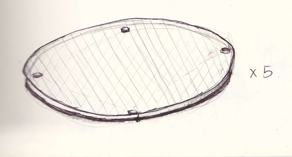
Yiyang and I made some good progress on our midterm project this week. We picked up a couple square-ish pieces of clear acrylic, at 3/8″ thick which we think will be the thickest possible for laser cutting. They are smaller than our initial concept, but it is helpful to test out the interaction. We used the drillpress to drill space for an RGB LED. Then we sandwiched sensors in between the acrylic pieces, supported by rubber feet, and tested the Arduino program to see what types of readings we were getting and get the light working in a nice way. We feel that the light and its slow decay is a very important part of the interaction because its decay will mimic the sound that the action produces.

First we tried a piezo from Radio Shack (above) but that sensor was too thick. Then, after it arrived in the mail from adafruit, we tried a force-sensing resistor, but that was not giving us a reading for some reason. Maybe we’ll come back to FSR’s later. But the best sensor so far was a flat round piezo that was working really well and also triggering the sound we want it to trigger.

We’re thinking to build a few drum pads for now, with the longer term goal of working towards a ‘step sequencer.’

Working with actual materials, sensors and code to make this prototype is really helpful for me. From here, we need to figure out a good way to keep the two pieces of acrylic together. We need flat rubber feet rather than rounded because they’ll be easier to stack. We need to find the best position for the sensor that will keep it insulated from vibration of the floor surrounding it (this was a problem until we moved the sensor to the middle of the acrylic sandwich—maybe we need multiple sensors in parallel? We’ll see). A lot will depend on the size we settle on for our acrylic pads. I think that the size we’ve been working with, roughly 5″x5″, is pretty nice, but originally we’d hoped to have bigger pads. If we do work with bigger pads we might need additional sensors to pick up the same force no matter where the user steps—this already impacts the sensor reading.

A big part of our project is the look and feel. I think the wires and sensors would look cool sandwiched between two pieces of acrylic, maybe we can drill a hole in the center of the bottom piece to pass everything through from the ground below. One way or another we’ll need to tidy and/or hide all of the electronics so that the user can focus on the sound, the light, and the feeling of dancing without worrying that they’re stepping on something that might break (hopefully it’ll be sturdy, too!).

I have been thinking about interactions in ways I had never considered.

Step Sequencer: Getting the Right Design and Getting the Design Right

In Sketching User Experience: The Workbook, Bill Buxton distinguishes between “getting the right design” (generating ideas and choosing the best) and getting the design right (refining that idea). Both are essential parts of the design process, both are iterative, and both involve sketching. For example, he advocates for the “10 plus 10” approach: first sketch ten different design concepts for the given project/scenario, and then sketch ten variations on the best design. I think this could be a cycle that just keeps getting more granular with each step.

Meanwhile, Yiyang and I have been brainstorming a midterm project for Physical Computing. She’s been doing most of the sketching so far while I overcome my fear of sketching, and so far it looks something like this…

IMG_0001_NEW-1s

Continue reading

Tone Lab

Yiyang took some videos of our experiments with tone generation during this week’s labs:

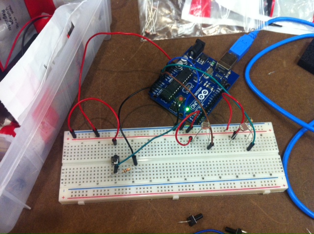
Those used photoresistors with a resistance threshold that would trigger tones. The tones for all three vary by a ratio when turning one of the pots. The other pot controls amplitude between the digital output and the speaker.

Later on I heard other students in the lab like TK an Dan doing really awesome stuff with arpeggios. So I experimented with each photoresister playing a looped arpeggio rather than a single tone. The pot controls how fast we loop through the arpeggio.

Code available here https://github.com/therewasaguy/Arpeggiator

PComp Observation: TAP ‘n GO

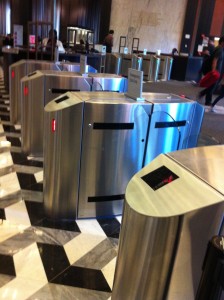
The TAP ‘n Go is an interactive entry/exit system for the Bobst Library. I became aware of this system the first time I approached the glass doors guarding the library entrance.

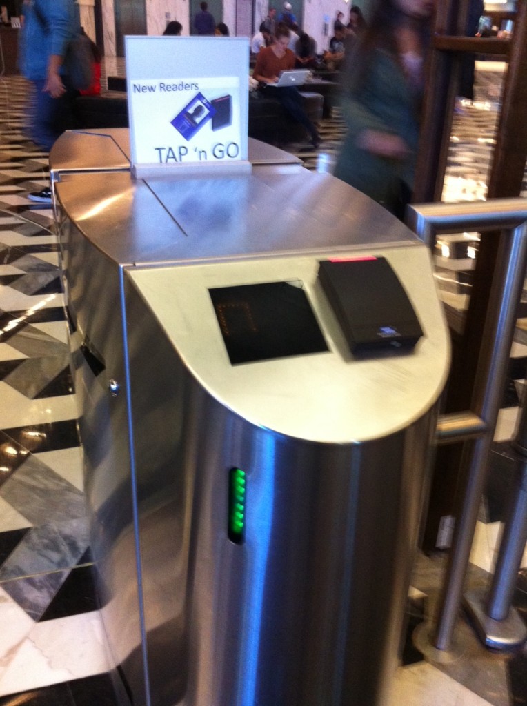
photo (21)   TAP 'n Go 1  photo (20)

The sign that said “New Readers” was not relevant to me because I had never been here before to see the old system. But the name “Tap ‘n Go” and the image of a card was helpful because I understood that I could open the glass doors by using my card. It was not immediately clear which set of sliding doors would open (to my right or left) but I learned by following other people as they used the system.

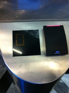
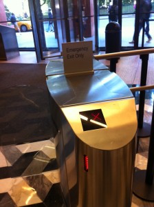
The yellow square on the front screen turns into an arrow that points in the direction of the glass doors you have just opened. The red light above the card scanner turns green as well, and a soft tone indicates that you may now enter. The green horizontal lightstrip on the side of each unit indicates that this is an entrypoint.

Once you are inside, the interface is reversed. The corresponding horizontal lightstrip is now red (instead of green) to indicate that this is not an exit. The yellow square is now a red X. There is no card reader. The signs say things like “Emergency Exit Only” and “Not Here.” If you try to exit through a Tap ‘n Go, there is a long, loud, sustained tone.

photo (24)  photo (23)  photo (22)

The proper place to exit is a scanner to ensure that nobody leaves the premises with unchecked library books. When somebody does, there are eight short tones to indicate an alarm going off, and the person guarding the entrance will inspect your bag.

My first interaction with the Tap ‘n Go was very confusing. I watched other people use it to get an idea of what to do (scan my ID card), and which set of glass doors would open. But when I scanned my card, I got a green circle instead of an arrow and the doors did not open. I tried a few times at a few different card readers and finally made my way to the security desk where I was told “this happens” and to call Card Services. I called and explained the situation, my card was activated, the yellow square turned into a green arrow, the glass doors slid open, and I entered the Bobst Library.

I observed a similar encounter this afternoon. A woman wearing headphones tapped her card, and proceeded to walk towards the set of glass doors that had opened for the previous person to use that card reader. The doors did not open. Frustrated, she backed up and tried the same reader again. No opening. Shaking her head, she tried the adjacent card reader. Same result. And again and again, until she finally made her way to the security desk and had the same phone call with Card Services that I had had. During this time, she listened to headphones and read a book in the lobbyish area between the Tap ‘n Go system and the revolving glass doors facing the street. I asked her to show me what happens when she scans her card, but by this time, her card had been activated, so she followed the green arrow into the library.

This was the longest interaction I observed with the Tap ‘n Go. Other lengthy interactions included people who experienced a “hiccup” where their card did not read on the first try. These people tended to be doing something else while scanning their card, and I’m not sure whether their interface beeped at them or if they simply heard a tone from an adjacent interface. Most of the interactions were very short.

This design makes use of some of Norman’s Principles of Design—it takes shapes we are familiar with and we understand intuitively that the glass doors will open if we swipe a card over the black surface. But there is not visibility to the set of possible actions. To the user, there can only be two results—the card is read and the doors open, or the card is not read and something is broken. When there is a response—either a tone or an image changing from a yellow square to green circle— but the door does not open, this doesn’t provide enough feedback to the user about what is happening.

Chris Crawford defines interaction as an iterative cycle in which two actors listen, think, and speak. In most cases, the Tap ‘n Go interaction cycle only happens once: it hears a card scan, it thinks, and communicates the results with open glass doors. However, this everyday object lacks “interestingness” in its thought process, and also lacks clear communication in cases when an irregular result occurs. Crawford advocates for interactivity as a means for sustained engagement, but sustained engagement is not desirable for anybody who interacts with the Tap ‘n Go.

PhysComp Week 2 Lab Notes

It has been a fun week of labs. At one point, I thought I fried my Arduino because it stopped responding, but a reset seemed to do the trick.

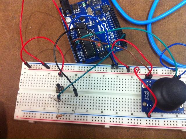
I decided I like to put LED indicator lights on my breadboard. For example, I’ve been putting an LED after the Mouse On switch. First it’ll go to Digital Input, then LED small leg (cathode), then resistor 10k (brown, black, orange). LED big leg (anode) and resistor connect to ground.

I was confused by Lab 2 part 2 where we were prompted to map(analogValue, 0.0, 5.0) with only three arguments. Don’t we always need five? I got an error until I added two more values, but wasn’t sure what top put there cuz the values I added shaped my mapping results.

Q: Why do we use delay between readings?

Q: If you make a led digital output pin an “input” will that fry an LED?

I’m inspired by motion with photoresistors.

pcomp_photoresistors

I also got a joystick that connects with power to both + inputs, analog output from L/R and U/D, and output to ground. So 5 pins to get it working properly.

pcomp_joystick Notice the LED next to the mouse-on switch (to the left). Wish my joystick had a ‘select’ button, it just has two potentiometers.

///Some notes from this week’s readings:

Donald A. Norman – The Design of Everyday Things 

  • visibility, clues, feedback on action. “natural design”
  • if it’s hidden, it’s invisible, and might as well not exist. Example: the lost telephone hold function.
    • if unused functions, “purpose of design is lost”
  • psychology of how people interact with things

Afford “is for” – like the affordances of a chair: it’s for carrying weight, it’s for sitting.

Constraints & Mappings

Principles of Design: 1.) Visibility 2.) Provide a Good Conceptual Model (to predict effects of actions)

“a device is easy to use when there is visibility to the set of possible actions, and the controls display natural mappings”

Conceptual Model – Designer’s Model vs. User’s Model’ vs System Image — make visible

Emotional Design” is Norman’s response to people who thought he didn’t care how things look, just how they function. He describes three teapots in his collection, including one that is impossible to use, but he loves all three anyway. He references studies that show how our gut emotional response impact our interactions. Emotion is primal. If something is unnatractively designed, we’ll focus on it more and maybe even figure out how to use it if necessary, unless we’re stressed out (follows a U-curve). If we are attracted to an object, we’ll enjoy using it more and we’ll be more playful in our interaction.

Physical Computing’s Greatest Hits (and Misses) is a great overview of some of the ways to use the tools we have learned so far. I love the Megatap 3000.

Week 1 PComp Journal

I watched Microsoft’s 2011 Productivity Future Vision before reading Bret Victor’s “Brief Rant on the Future of Interaction Design.” The “Vision” video struck me because of the limited options these imagined systems seem to provide their users. They didn’t seem to allow for much in the way of individual expression because they relied so much on predicting what looked like a very limited set of actions. These limitations make the interactions appear elegant in their simplicity, but lack a “human” feeling even as the video demonstrates a belief that unobtrusive almost-invisible technologies will bring all kinds of people together.

Bret Victor’s “rant”—a response article from a seemingly disgruntled former Human Interface Inventor at Apple—was most concerned by the Vision’s excessive use of hand gestures to control screens he described as  “pictures under glass.” None of the screens had any texture to them, and in Victor’s view this Vision neglects the most important elements of human capabilities. As a musician and person who likes to see live music, I think a lot about gesture—the best performances tend to have motion that resonates with the music to create the complete experience. And I’ve never been very impressed by the gestures of a laptop/iPad musician—the best of these types of performers always incorporate some kind of external controller or at least a dance/movement that is a response to the music rather than an interaction. As an iPhone user I had recently been thinking about how much I miss being able to feel the keys as I type. I had never considered quite how elemental this tactile sense can be in our interactions (for example I’m realizing how much I love the way my hands “feel” which page I’m on in a book and how much I wish that I was reading this article in a book…). I’d also never thought about how insignificant the “swipe” gesture that we use to control tables/iPhone/Future Vision interactions is in relation to the “four fundamental grips.” I also took note of Victor’s definition of a “tool” as something that amplifies human capability to allow us to do what we want/need to do, and I’m inspired by his belief that it’s up to us to use existing tools to create new ones that will shape our future.

Chris Crawford’s Art of Interaction Design helped me define “interactivity” and articulate why I am so excited about ITP’s approach. He defines interaction as a cycle of engagement in which two actors 1. listen, 2. think, and 3. speak. Listening requires understanding/comprehension, thinking requires interestingness, and the response (“speaking”) requires clear communication. All three are necessary for the action to be an interaction, there can be no “weak links,” otherwise it might be more like a reaction (i.e. reading a book), or participation (i.e. dancing). The interaction can take place between two actors whether they are human or not, and I love the analogy to conversation.

I had never really understood a distinction between an Interaction Designer and a User Interface Designer, but now I understand that the former is the holistic approach that incorporates both form and function. User Inteface optimizes design (speaking) but doesn’t touch the thinking side of things the way that interaction design does. Crawford believes we are in the midst of a paradigm shift in which a younger, less technical (i.e. math/science) but more “webby” generation of Interaction Designers will draw on their arts/humanities backgrounds while incorporating the wisdom of User Interface to become the new norm. So I’m glad I’m in this program.

PComp Day 1 “Fantasy Device”: MagRail + MagScoot

(via the internet post

(100km traffic jam, via the internet post)

Every year, a greater percentage of the world’s population moves to urban areas (source), where traffic is becoming a huge problem. Inspired by the situation in her hometown of Bangkok, Kate thought wouldn’t it be great to fly above the smog? So for our ‘Fantasy Device’ in today’s first session of Physical Computing, where we were invited to invent something that does not exist (and might not be technically feasible), Kate and I came up with a magnetized scooter and rail system called MagRail. The dividing line would become a system of two magnets, and MagScoots would hover above them with a magnetized strip. We don’t know how feasible this is, and at this point we don’t really care. The important things are the MagScoots.

MagScoots are 2-person scooters with a magnetized strip at the bottom so they can hover on the MagRail system. They have a luggage container in the back that doubles as a seat for a second passenger. They have handlebars at the front and only one button with two settings: On and Off. When they are Off, the magnet is shielded and the MagRail’s powerful magnets have no impact. When they are turned On, the magnet is revealed and a light activates in the back so that they can be easily seen by other MagScoots. They have a motor in the back that propels the MagScoot forward at the same speed as all other MagScoots. They also have sensors on the top, bottom, front and back that detect when other MagScoots are nearby to avoid accidents during takeoff and landing. Takeoff and Landing (the transitional moments between Off and On) are the most important moments for MagScoots. During Takeoff mode, if sensors detect that it is safe for takeoff, the magnet shield flutters back and forth to gradually expose the magnet that will raise the scooter at an appropriate velocity. This flickering also impacts the light at the back of the MagScoot. During Landing, the shield flickers again to lower the MagScoot in safe increments. For more, check out Kate’s write-up on the MagScoot.