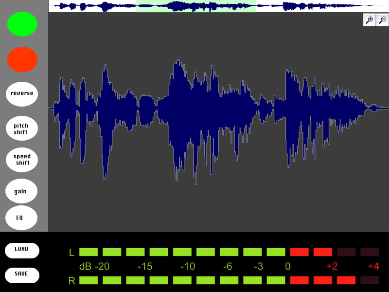
Audio Transformer, the Web Audio Editor, is online in a functional demo mode. It’s not ready for public testing until I prepare my server, and there are many features (and bug fixes) yet to come. But if you’d like to check it out, here it is (source code here)…
I had the chance to user-test with my ICM class, and observed that graduate students tend to start by pressing the button on the left and moving to the right. Only those who really knew what they were doing with audio editing would jump straight to the fun stuff (effects). A few people also thought to press Spacebar for play/pause, but most didn’t think to do that, so I added a “spacebar” text hint to this button. At that point, there was a button to place markers at a spot on the waveform, and everyone wanted click’n’drag to select an area, so I’ve begun to implement this. I also added Loop mode, with a symbol that shows up when loop is on, though if I have the time I’d like to develop my own buttons that look like physical buttons.
“Speed Up/Down” has little effect on the waveform, so there needs to be a way to show that the length of the file is changing, otherwise it doesn’t look like those buttons do anything. I added a timer in the top-right but would like to visualize this more clearly by showing the full waveform in a skinny timeline at the top, and the selected area in the bottom. As the file shortens, the zoom-level stays the same, so the selected area will grow in proportion to the full file. This’ll make a lot more sense if I can just show you what I mean. Other comments were that the frequency spectrum colors didn’t seem to correlate to the waveform colors, and if the colors that represent sound should be link.
Before presenting this to kids in my workshop, I need to indicate when WAE is processing audio, and grey out the buttons so that they can’t freeze the program by overloading the “speed up” button.
I am subbing for my friend’s Scratch video-game workshop, and I had the chance to work on sound effects using the Scratch interface:

Scratch has been a big influence on my approach to “designing for tinkerability”, as has a lot of the projects and research coming out of MIT Media Lab’s Lifelong Kindergarten Group. Its audio editor has a concise, efficient design. They don’t overload the user with too many parameters, for example, they leave things as “louder” and “softer” rather than a volume slider. This is the way I’ve implemented my effects, though I think that in the name of tinkerability, I should not only provide a preset starting point, but also provide an advanced mode for users who wish to dig deeper.
Scratch gives kids three options for sounds: 1. record your own, 2. choose from preset sounds, 3. upload a sound. The kids wanted to try each of these. One group wanted to record their own voices saying “crap!” Another went to YouTube trying to figure out a way to bring the Dr Who theme into their project. And others explored the library of existing sounds. I think that offering all of these starting points would strengthen the web audio editor.
Designing for kids as young as 2nd grade is difficult because they aren’t all able to read at the same level. This applies to words, but it also applies to symbols. For example, when I asked the kids to play a sound in Scratch, some didn’t know what button to press. They hadn’t all been exposed to a sideways triangle symbol as a play button. Even if it said “play” they might not know what it means to “play” a sound. I don’t know if there’s a better way to convey the meaning of these abstract audio concepts, but I think that using the most simple, conventional names and symbols will help establish meaning that will stick with them later in life.
As my Physical Computing teacher Tom Igoe says, there’s no such thing as ‘intuitive’, just learned behavior. So in an educational setting for kids who’ve never worked with audio before, it will be necessary to point out some things.
Just this morning, I had the opportunity to present this project to a 5-year old. At first, thanks to her guide pointing out the foam chair, she was more interested in picking up the foam chair than in working with the Audio Transformer. When she sat down, I gave a short explanation that this is a way to listen to sounds and change the way they sound. I showed her how to click and drag a file from a desktop folder into the browser, then pressed buttons to change the sound. She was much more interested in dragging the sounds than in modifying them. Click’n’drag is a difficult skill for novice computer users, but she told me she’s been working on it with her dad, and she seemed intent on mastering it now. The dragging distance proved too far for her to manage, so I helped load the sound and then encouraged her to try pressing the buttons. She didn’t understand which button to press to play the sound until I pointed it out, and from there she successfully slowed down and reversed the sound and played it back. She was on a tour of ITP so my project had a lot of competition for her time, but afterwards she said that the project was “fun.” I asked if there was anything that wasn’t fun and she said no. I think this is a good sign, but I’d like to try to make it easier to load readymade sounds—perhaps within the browser itself the way Scratch does—without the need to click and drag.
As things stand, I have several features I hope to implement:
Don’t afford the ability to press buttons while audio is processing (because it causes errors)(but could be done more elegantly)- Allow Edits w/ better highlighting of selected area
- Zoom mode w/ additional waveform view update, highlight selection
- Spiff up interface with symbols that can help bridge a child’s current level of understanding with audio-related symbols that’ll carry meaning later on in life.
Allow Record (WebRTC?) https://github.com/muaz-khan/WebRTC-Experiment/tree/master/RecordRTC/RecordRTC-to-PHP(but stops recording properly [gets glitchy] after ~three recording sessions or if a file is played until the end…why??)- More options for starting sounds (preload a range of cool sounds and waveforms)
- Oscilloscope ( http://stuartmemo.com/wavy-jones/ ) because the wavesurfer plugin isn’t as preceise to illustrate the concept of a sine wave, triangle wave etc they just look like big blocks of sound…
- Better Undo/Redo (download page with all files at end of session then delete them?) ///// on close, delete all of the files. Filesize limit. These are important before making the website public so as not to overload my server.
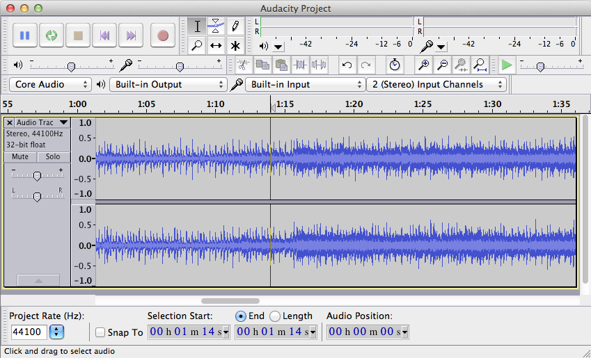
- “Advanced Mode” allowing user to tweak effect parameters. Audacity has too many parameters, Scratch has too few, WAE should provide a simple starting point but allow tinkering for those who wish to dig deeper and explore
[ Dec 7th update: crossed two items off the list)


 Mitchel Resnick is the director of MIT Media Lab’s
