Color Composition

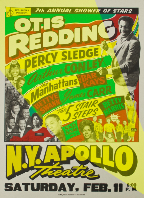
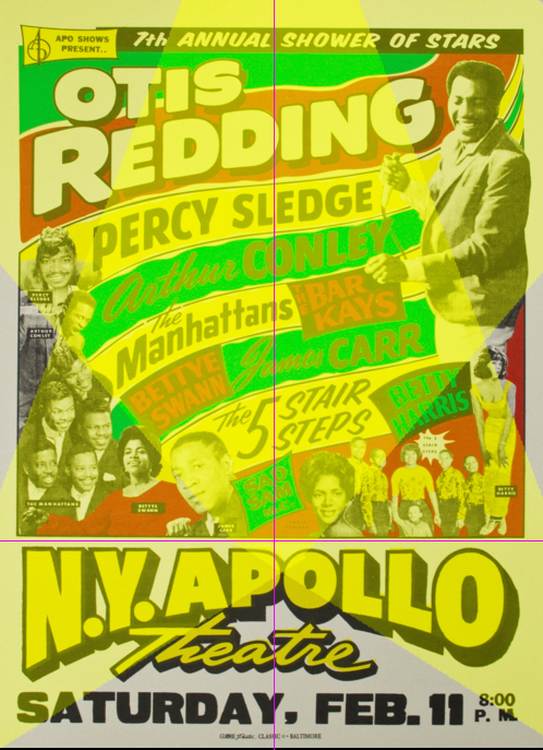
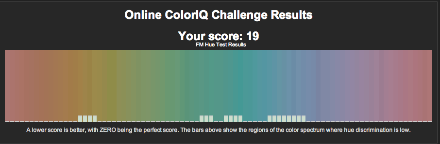
I scored 19 on my Color Test, which isn’t perfect but hey, it’s not so bad. Actually it’s great! I had always thought I was color blind because I took a test at the doctor once where I was supposed to say which was the letter L was pointing, and I didn’t see the letter, it just looked like a magic eye. Turns out I’m just no good at magic eyes!

Screen Shot 2013-10-18 at 1.34.30 AM


For my Color Composition, my first thought was to draw inspiration from abstract geometric artists like Piet Mondrian and Kazmir Malevich, because I love the way that these very minimal compositions use color, like this. It’s interesting to think about what kind of approach these artists might have taken if they had computers at their disposal, let alone tools like processing. Maybe they would have created a system that automatically generates a random composition according to a few sets of rules. Maybe they would have animated their paintings (there are some great examples of this). But after getting bogged down in the math of pixel coordinates and making something that I was not so pleased with, I decided to put this idea aside for now.

I used Processing to create an animated geometric composition that changes one aspect of its color depending on the position of your mouse. There are three variations:

Screen Shot 2013-10-18 at 11.14.35 AM

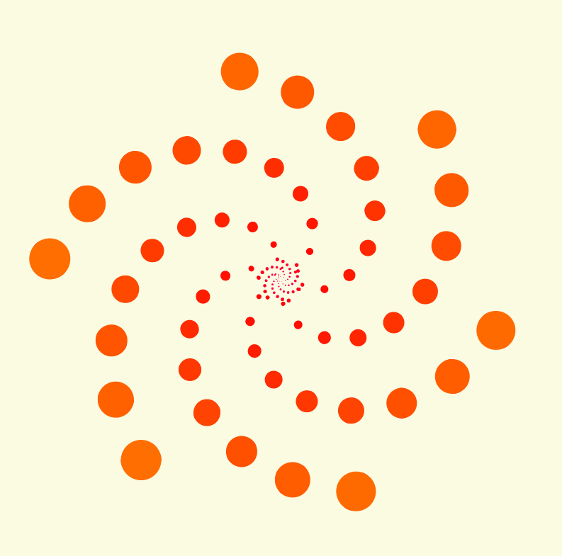
HUE – The circles are all monochrome colors within a range of 30 on the 360 scale. The range changes depending on the mouseX position. If you click the mouse then the hue of the inner ‘ring’ is offset by 30. So one click gives you analogous colors vs the outer ring. Four clicks gets you 2/3 of a triad. Six gets you in a complementary range and so forth. Meanwhile, the mouseY position controls the brightness of the background, which is a desaturated yellow at its brightest (attempting to emulate the color of a canvas), and nearly black at its darkest. The hues feels very different depending on the brightness of the background.

SATURATION – in this version, mouseX controls the saturation instead of the hue. I stuck with a fixed brightness in the background to really see the difference, but mouseY instead impacts the saturation of the background. Clicking changes the inner ring’s color range.

BRIGHTNESS – Now, mouseX controls the inner ring’s color range. When the colors are very dark, you realize that the background was not as black as it seemed, and can really see the difference between the saturated background (mouseY towards the bottom) vs the desaturated (mouseY towards the top).

The Peavy Logo

In some circles, the Peavey logo has a bit of an uncouth reputation (like the brand itself, it is controversial), but I think their logo is perfect for what it represents.

peavy_amp

Peavey is best known for making cheap but durable rock amplifiers with buzzsaw overdrive. Their logo is jagged, it screams “rock ‘n roll” (I think there’s even a subconscious R n R in here, and I love how the A and V play off each other). On the one hand, it looks like it was chiseled from a rock. On the other, you can almost feel the electric energy. Peavey was founded in Mississippi in 1964 by Hartley Peavey, an aspiring rock musician. He wanted an electric guitar but his dad wouldn’t let him, so he built his own. The logo first appeared as a doodle in Peavey’s grade school notebook. When I see this logo, I think of when I was in grade school and just wanted to rock but my parents wouldn’t let me etc.

4889591269_79aef05993-431x323

In the early 1990s, Peavey changed their logo to appease Eddie Van Halen. They made an amp for him, the 5150, but he wouldn’t stand for the original “lightning” logo, said it didn’t fit his style and he didn’t want it on his Peavey amp. Meanwhile, he was playing a guitar that looked like this..

Frankenstein-Guitar-Eddie-Van-Halen

…but whatever.

So to appease EVH, Peavey changed their logo to the Delta logo in the early 90s. The letter A and V still play off each other, but the A is a triangle (delta) shape, perhaps a reference to “change” as in changing their logo, or “delta” like the company’s origins in the MIssissippi Delta.


230148887316-1

peavey_gold_on_black_616

In the early 2000s, they switched back to the original Peavey logo, confined to an oval.

116888

I definitely like the original logo better. But some preferred the Delta logo. Others dislike both of them. It’s controversial. I know this from researching the Peavey logo controversy online where I found that the “Talk Bass Forum” recently held an unofficial Peavey Logo Redesign Contest. In my opinion none of them come close to the original Peavey logo.

In an era when anybody can access a world of readymade typefaces and make things look spiffy in Illustrator and Photoshop, I think the Peavy logo stands out more than ever. Sure, it’s a little busy and maybe hard to read, but nowhere near as bad as these black metal logos.

16746_logo


indecipherabledeathmetal

ITP Logo Redesign

I pictured ITP’s logo as having a digital feel, but also round and human, maybe like fingers. Perhaps at an angle. So I started looking for rounded fonts and found VAG Rounded which looked exactly like what I was picturing. It wasn’t free, so I found BPreplay which was just as perfect.

ITP_draft5c


Earlier drafts, trying to do something that maybe wasn’t necessary with the lines?ITP_draftb ITP_draft1

Typography / Words as Images

Setting my name in Sans Serif

jasons_futurabold3


JavaScript-logoFutura Bold reminds me of the JavaScript logo, which happens to share my initials.

jasons_verdana

Verdana Bold Italic: I like the unique shape of the J, the symmetry between the I and L which both have ascenders above the cap-height, the high x-height, and the lowercase g descender looks good in the bottom/middle like this.

Verdana makes me think of Green. After making this, I learned that verde/green is part of the typeface’s inspiration, and that it was made my Microsoft. I guess this makes me nostalgic for Windows 95. I also learned that the design world thinks this typeface is boring.

“The Verdana fonts,” Microsoft explains, “are stripped of features redundant when applied to the screen. They exhibit new characteristics, derived from the pixel rather than the pen, the brush or the chisel.” Verdana, designed by Matthew Carter, serves technology not by seeming technological but with its leanness, height and loose spacing; it is bland, but efficient. The Ikea spokeswoman called it “a simple, cost-effective font.” (read more)

Coincidentally, IKEA caused an uproar when they switched their typeface from Futura (above) to Verdana.

jasons_gillsans

Gill Sans light…looks like a fashion designer logo. I like the descender on the J, and how it compares to the level L making a right angle at the right side. I like the angles and symmetry of A, N, S, I, O, and how the G is not quite an arrow.

Setting my name in Serif

jasons_widelatin

Wide Latin – I like these angled brackets connecting these serifs to their stems. Also, I didn’t have to adjust the kerning to get the words to align!

jasons_CooperBlack

Cooper Black – This feels like a “back to school” typeface with fun, round, slab serifs. I like the stress of the O. To get the two words to align, I adjusted the kerning and fattened the stems of the I and L.

jasons_monalisa

Mona Lisa Solid ITC TT – Not sure where this one came from but it makes me think of classic Hollywood, Manhattan, Paris and film noir. I like the contrast between the low Xheight, and the gigantic giant stems of the J and L as bookends.

all_typefaces

Words as Images


alien_abduction3 Alien Abduction – OCR A Std, an early computer font. It has some serifs but only to make each letter easily distinguishable via computer screens.

beer_stonesans_22

Beer – This is a modified Stone Sans. I hammered the B into a beercan shape (very unlike its original form) and rounded a lot of corners. I gave it a bold weight like a beer belly.

speak2 Speak – Arno Pro

Continue reading

Signage

This week, we read The Secret Language of Signs: the most useful thing thing you pay no attention to. I have been paying a lot of attention to signs everywhere I go. I think that most signs around NYC are a-ok—they’re not great, but they’re not horrible, and they serve a purpose, they get the job done given their circumstances.

WHAT’S GOING ON HERE?

whatsgoingon2

The “What’s Going On Here” signs at city construction sites are an example of a sign that “gets the job done.” Nobody cares to read about why the construction is happening, they just want to get where they’re going, but for some reason (the law?) these wordy signs appear wherever there is construction. They are not designed to be read in full and I have to believe that this is intentional. The colors are a little bit jarring, but for anyone who might be wondering “what’s going on” they’ll see that title up top nice and clear and they can read all about it and get even more information if they are so inclined. Still, the sign could be condensed, the colors could be less in-your-face / boring, and an image could go a long way.

BROOKLYN COMMUNITY DAY CARE CENTER

bkcommunitydaycare

This sign for Brooklyn Community Day Care Center looks like it might a s well be a sign at a construction site. The text is small and hard to read. The most important thing (the first to catch your eye) is the phone number because it’s in bold. The color scheme looks like a warning/caution sign, not a sign for a day care center. This sign needs to highlight that it is for a daycare center because that message is lost.

DO NOT WAIT IN THIS AREA

donotwait


This sign is confusing because it’s placed at a subway platform where people have nothing to do but wait. Why can’t they wait in this area? How far does the area extend? These questions are not answered by this sign or by any other signs. So people inevitably ignore the sign and wait in this area. No harm done, right?

USED CARS

This sign has a clear message and every design choice supports the message. Used Cars is the spotlight, and then you see that they’re also safe. The color scheme and typography support the nostalgia feeling of a classic car, maybe you’ll find the car of your dreams here.

WATER BOTTLE FILLING STATION

tap_for_WB_orig

I saw this sign and thought I could make it better…the typography is nice and clean/clear but I think the message could be conveyed without any words (similar to how a STOP sign is better conveyed by the red shape than the words).

tap_for_wb_reviseI don’t know if I succeeded, it’s just a prototype. Maybe the top section is not needed and there could just be one water bottle, but the top sign is at a better level to catch the eye. Continue reading

Visual Language: Poster Analysis


shower_of_stars_2

A framed print of this iconic neon poster caught my eye earlier this year. For this assignment (to analyze a piece based on the Principles of Design), I did some research and found that it was printed in 1967 by the legendary Globe Poster in Baltimore, screenprinted on letterpress with Day-Glo ink (more info here).

Principle of Design #1: UNDERLYING GRID

First I looked for a straightforward grid…

shower_of_stars_grid

Some parts of the poster adhere to this grid, especially the top and bottom. But in the upper two-thirds, there are so many curvy, angled lines that I really felt like there were other grids in action:

shower_of_stars_angledgridStill, the grids don’t quite capture what’s going on in that upper area. I traced a horizontal line from Sad Sam to Percy Sledge. And another from Betty Harris to Otis Redding holding the mic.

shower_of_stars_spotlight

I think this line is reinforced by Sad Sam’s face, and the angle of the first L in Apollo, and the way the Manhattans are arranged. Then I saw another symmetrical horizontal line:

shower_of_stars_spotlights_grid

Together these spotlights contain all of the performing artist photos, and they look kind of like a Hollywood spotlight, which would fit the theme of this poster. The spotlights might just be my imagination. but I believe they are reinforced by the placing of artists and the curve of “NY Apollo,” where the two spotlights intersect at the vertical center of the poster, in a spot that divides the performers from the venue/show info. So in my interpretation of the poster, there are invisible spotlights.

Principle of Design #2: TYPEFACE

One of the principles of design tells us to limit typography to one or two typefaces, usually one serif and one sans serif. But this poster totally violates the rule! There are TONS of typefaces—at least five by my count, possibly as many as seven (unfortunately it’s hard to see the smallest ones in this lo-res digital file).

7thannualmanhattans

stairtheatre
redding saturdaybettyharris

sledge

Upon closer inspection, I think the last three are different weights of the same font, also used for Bettye Swann, Betty Harris,  The Bar Kays, Carr and Conley. “Otis Redding” and “Apollo” might also be variations on this same font with some shadowing. I think that font is either Proxima Nova or Bluset, however “Saturday” looks like more Wooddale Condensed Regular. The first font looks like Okay. I had trouble using What The Font with some of these clips because they’re pretty much all warped.

The typeface is interesting because it is so expressive and rather than pairing sans with a serif, sans is repeatedly paired with a cursive script (is there a name/category for cursive?). Why are the first names of James Carr and Arthur Conley written in cursive, while Percy Sledge is all bold (same font as Carr and Conley last names only). I don’t know, but it looks cool, and the  typefaces contrast really well with each other to help paint a picture that this is going to be an exciting event with a lot of distinct stars.

Principles of Style #3 & 4: HIERARCHY OF ELEMENTS & NEGATIVE SPACE

shower_of_stars_negativespace

Otis Redding is clearly the headliner here, and the details about the venue and date are presented in clear readable typeface with plenty of space around them. For example, Otis Redding is the only artist who gets two background colorstrips, and the venue/date info are surrounded by negative space. I especially like how Bettye Swann’s shirt blends in with the red negative space to become part of the background, but also helping draw a line between her and The Manhattans. The labels for each artist’s photograph are tiny enough to stay out of the way, which is good because their names are already listed on the poster. They’re laid out in a way that helps people make sense of who’s who, but the additional nametags aren’t completely redundant because it’s not immediately clear, especially in the case of Carla Thomas (bottom center). With all these artists on the bill, there is a lot of information to take in here, and, even though it’s given a prominent position at the top without any background distractions, it’d be easy to miss the name of the event itself—”Shower of Stars.” I like how each artist gets their own spotlight, and the typefaces and design choices all serve to emphasize that this is a “Show of Stars.”

Principles of Design #5: COLOR

shower_of_stars_altversions

I was drawn to this poster because of its vibrant neon color. But I’m not sure if the designer had a specific color in mind, because I’ve found several versions of this poster. This might indicate that the poster was screenprinted with a few different color schemes following the same color guidelines. The one I’ve used has erased Carla Thomas’s name from the bill some reason (otherwise we’d add one more typeface to the above list). Maybe she had to cancel her appearance at the Apollo on this tour, but played shows at other stops along the way, and the composition of faces was too good to remove her face from the poster which would explain why her face is still on the green bill. Each of the other color schemes is vibrant in its own way, and I read that they used Day-Glo ink made out of fish scales to catch people’s attention even at night.