FMA Social Data

FMA-Genre-User_bipartiteI applied some of the many techniques that we covered in Gilad Lotan’s Social Data Analysis class to the Free Music Archive, a curated resource for free legal mp3 downloads. I directed the FMA before coming to ITP, so I already had some hunches about what I might find. But I had primarily dealt with its database through a CMS, and I was excited to explore using new tools. My goal was to uncover data that could help users discover music, connect users with similar taste, chart trends and make sense of the FMA’s user community.

Using custom MySQL queries, I worked with timestamped tables for Track Favorites, Track Downloads and Track Listens, as well as tables for Genres, Friendships (between users), Users, and Tracks.

My first hunch was that only a very small percentage of users sign up for accounts, since you don’t need to register in order to download. I found that of 58,012,839 total track downloads, only 401,380 ( 0.69 %) were associated with a logged in user ID. I decided to limit my Track Downloads data to logged in users, because a table of 58 million was hard to work with.

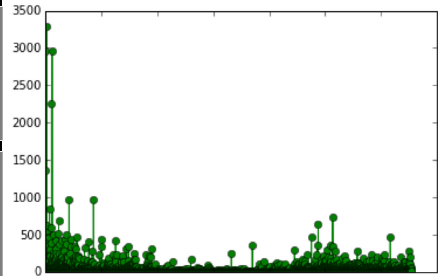
My second hunch was that, of the registered users, a much smaller group of them is the most influential, active, and inter-connected, and it might be useful to highlight the recommendations of these more active users. I found found that 37,140 registered users have downloaded a track, 21,664 users have favorited a track, but only 1,303 have created a playlist. For each of these metrics, there are a few very active users, and a long tail of users who are less active. For example, here’s what the graph looks like mapping user ID to number of favorites:

User ID to # of Favorites

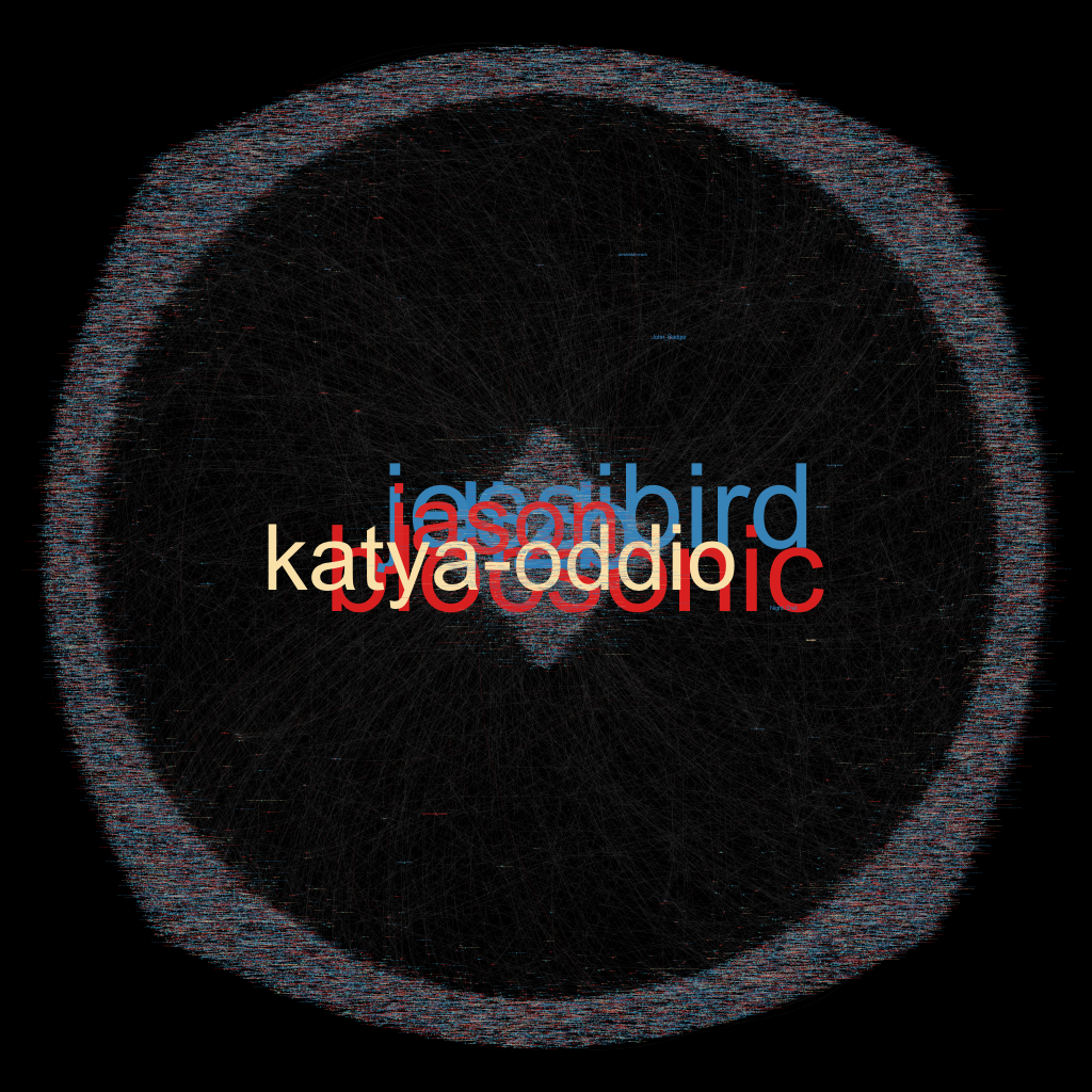
I wanted to get a better sense of the user community of the FMA with a network graph. I created a graph using NetworkX in Python, where every user who has favorited a track gets a node, and edges are drawn between users who have common favorites, as well as users who friend each other. I plotted the graph using different layout algorithms in Gephi. At first, I found it difficult to isolate modularity and find communities within the FMA userbase beyond one central group and a bunch of relatively quieter outsiders.

fma_friends_faves_clustering

fma_friends_01

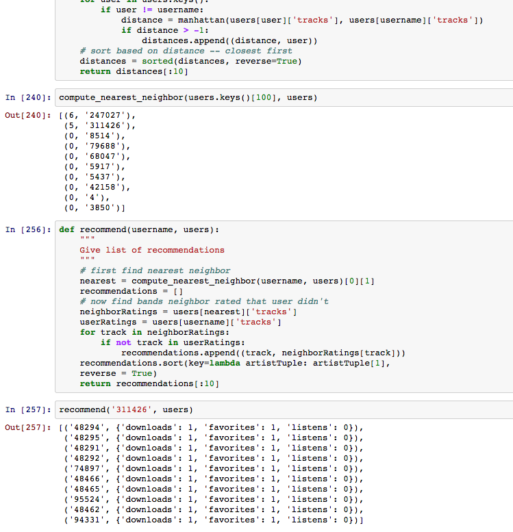
My hunch is that users can provide a great pathway to music discovery. But most users don’t participate in the social aspect of the site by friending their fellow users, and it’s hard to find users since there is no user search functionality. So I made a recommendation method that suggests users based on favorites, listens and downloads. I used Manhattan Distance and Nearest Neighbor Algorithm so that users’ tastes do not need to overlap directly. I don’t have great visuals to show for this, and I’d need to keep working on it before it could offer really good recommendations for tracks and/or users, but I think it would be a useful thing to bring to the site. It could recommend both tracks and users based.

Nearest Neighbor user recommendations

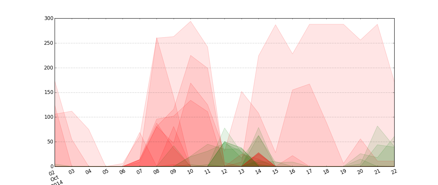
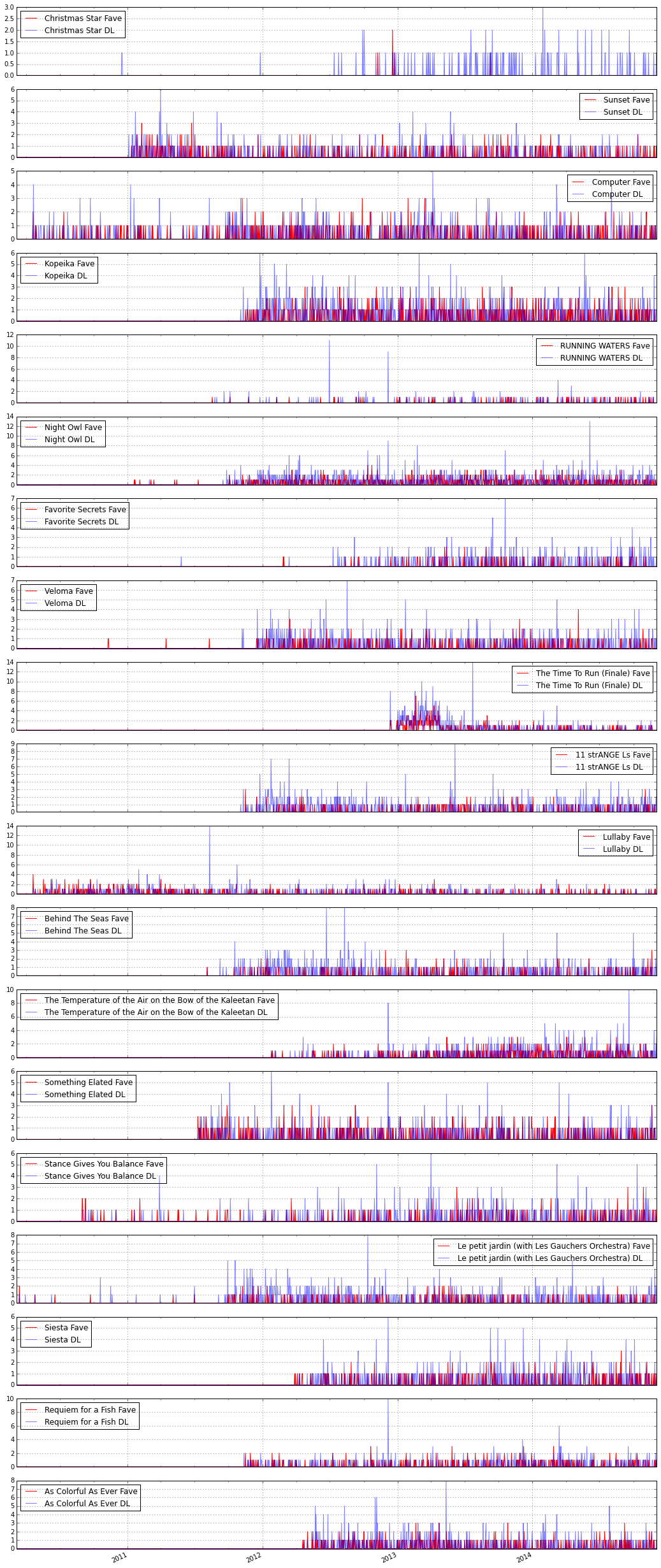
Next, I wanted to see how tracks achieve popularity on the site. Is there a correlation between favorites and downloads? I compared time series data for favorites and downloads (by registered users only) for the 10 most favorited and 10 most downloaded tracks. Click to expand these:

faves_and_downloads_time_series

Brian Clifton suggested I use Rolling Mean to get a smoother plot of the data:

faves_and_downloads_time_series_rollinMean

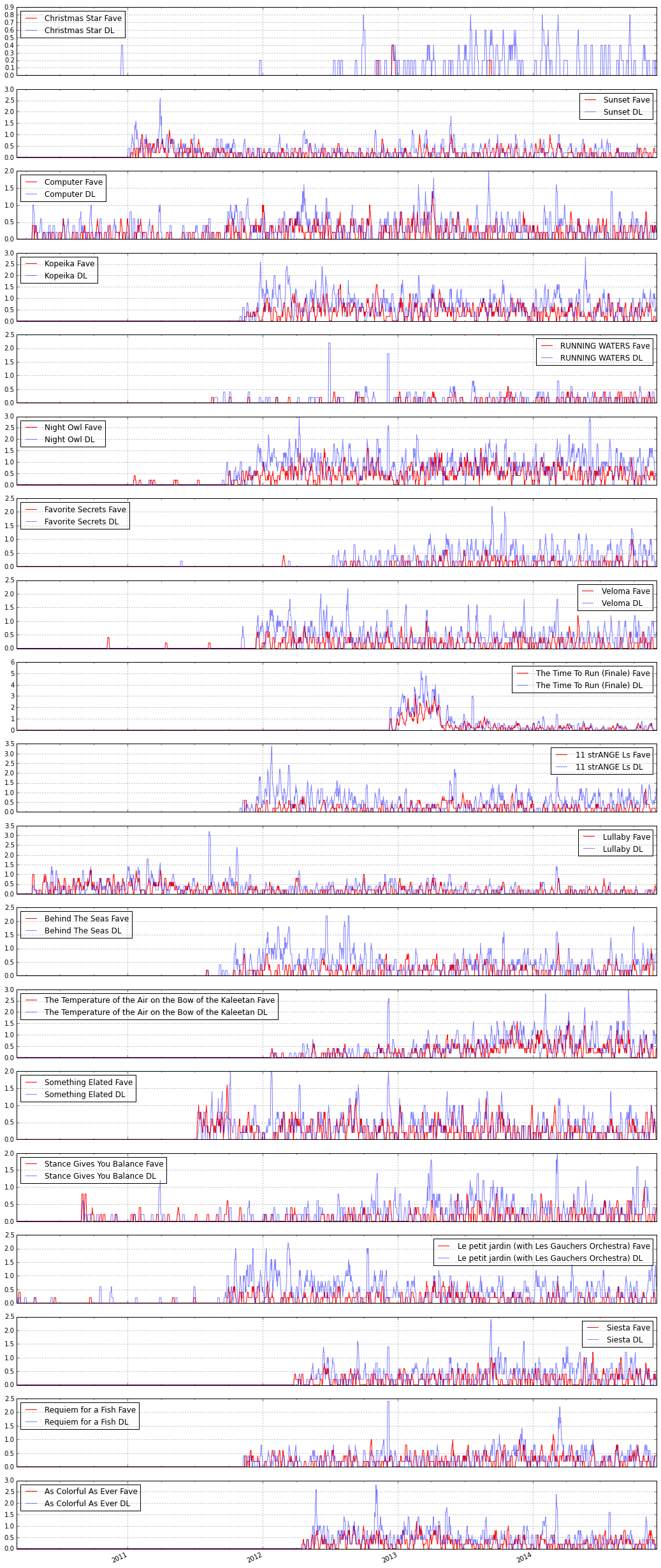
I was surprised to find relatively steady trends here—some tracks are consistently popular. On the other hand, some seem to take a while before becoming popular. Others are downloaded frequently, but not favorited, like the Christmas song—why is that? During class presentations, it was suggested that I dig deeper into this Time Series data to find if the users who favorite are also the users who download.

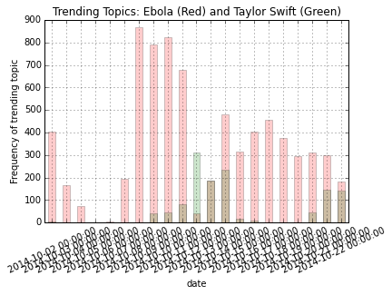
Looking at the time series data for all favorites, I found that there were big spikes in favorite-ings on certain days:

Screen Shot 2014-12-03 at 7.41.19 PM

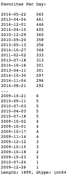
I wanted to see if these days meant that a specific track had debuted on the site—perhaps on the front page—or if a user suddenly became very active in exploring and favoriting. I found that, in many cases, days with many favoritings like May 22 2014 were when a new user registered for the site and started to favorite a bunch of tracks.

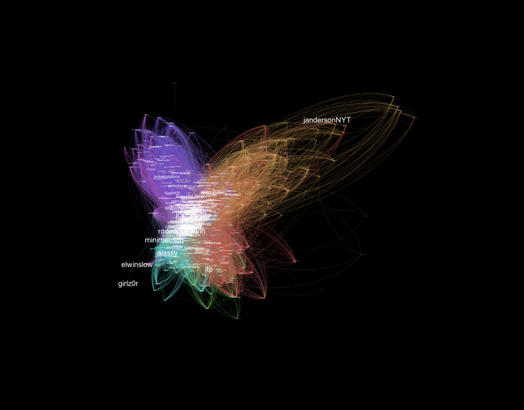
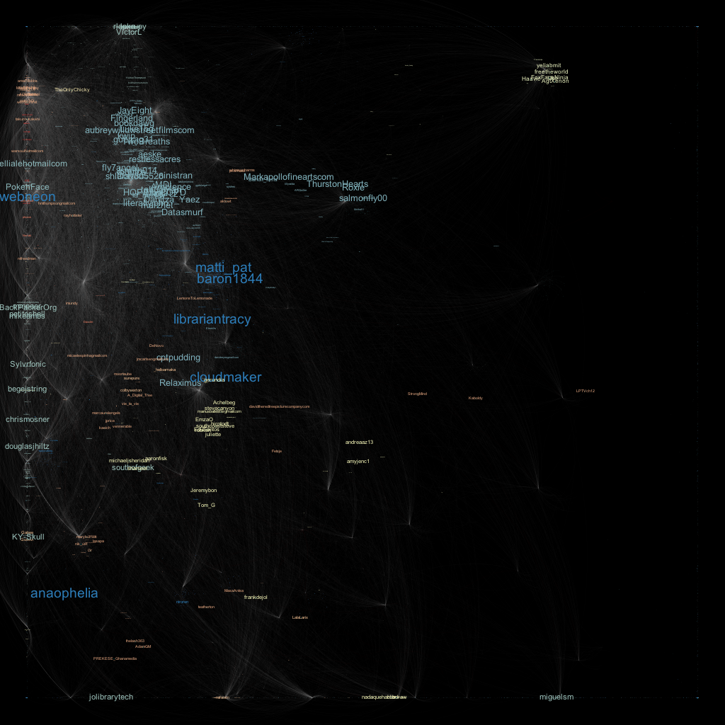
When certain users favorite a track, does that lead it to become popular? I tried to calculate the influence of certain users based on when they favorited tracks that would go on to become popular. My first approach involved calculating the “deltaTime” in seconds between when they favorited the track and when it was first published, and factoring in the amount of total favorites. Later I found a more useful method of assigning influence to a user would be to weight every user who favorited a track after the user’s favoriting occurred. I used the time series data for the 1000 most popular tracks, and calculated the influence of every user who had favorited those tracks.

I further differentiated each user by giving each user a dictionary of genres, and this way every user could have a global influence, as well as a genre-specific influence.

This resulted in a very different graph of users than my initial graph, and it highlights different users who I had never come across before.

genre_viz1


I would like to continue exploring methods to spotlight users who are influential within particular genres, so that when FMA visitors browse by genre, they could be recommended users to follow. The “browse by genre” results could also spotlight tracks that are popular among the most influential users / tastemakers within that genre.

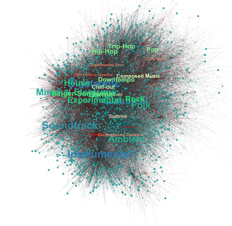
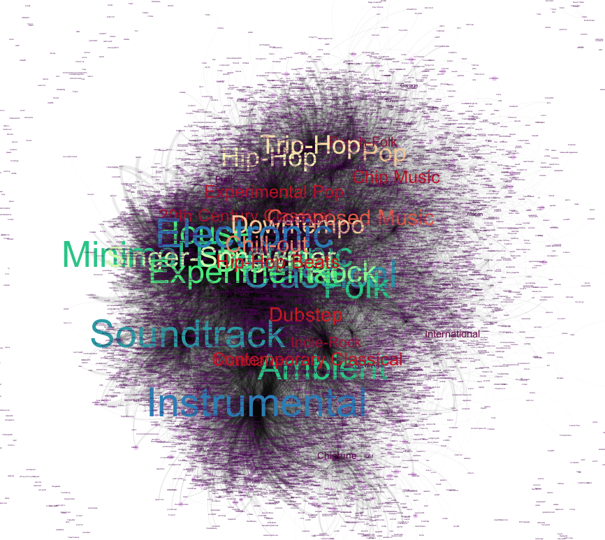
Finally, I made a bipartite version of this graph, with edges between users and genres based on how many tracks they have favorited within that genre.

Screen Shot 2014-12-04 at 8.30.15 AM


Screen Shot 2014-12-04 at 8.10.54 AMLots more to dig into, but never enough time.

Time Series Analysis of Trending Topics: Taylor Swift & Ebola

I thought it might be interesting to plot two very different trending topics over time using Twitter Trending Topic data. I imagined the twitterverse would be caught up in a pop culture vortex anticipating Taylor Swift’s new album, but in fact, all it took was one Ebola case in the US to turn it into a massively trending topic. Ebola has trended 78709 times this month, while Taylor Swift has trended only 3253 times. Obviously this is not a fair or appropriate juxtaposition, but I went ahead with it anyway.

Area. Red = Ebola, Green = Taylor Swift

Stacked Bar

For the Taylor Swift plot, a key date is Oct 21st when Taylor Swift accidentally released 8 seconds of white noise on iTunes in Canada, topping the Canadian charts. Oct 12th she made TV appearances and announced that she would release a new single on Oct 14th.

For the Ebola plot, a key date is the first death from the virus in the US on Oct 8th—leading to a huge spike in twitterverse. On Oct 13th, a nurse who became infected was identified and revealed to be on the road to recovery, and there is another spike.

I used the top locations where Taylor Swift was trending for both plots. Below is the full list of top 10 for each topic. Interestingly, Ottawa is the most on top of both of these trends.

# of times “Ebola” was in the Trending Topics this month:
Ottawa 2520
Toronto 1745
Portsmouth 1666
Bristol 1603
Austin 1542
Denver 1482
Birmingham 1471
New Orleans 1464
Cincinnati 1461
Winnipeg 1429
Norfolk 1409
Indianapolis 1308
San Antonio 1274
Atlanta 1269
Detroit 1268
Orlando 1248
Dublin 1245
Dallas-Ft. Worth 1236
Providence 1231
Phoenix 1222

# of times “Taylor Swift” was in the Trending Topics this month:
Ottawa 184
Brisbane 146
Birmingham 141
Kuala Lumpur 140
Dublin 140
Manchester 132
Brighton 106
Calgary 96
Leicester 88
Sheffield 87
Glasgow 82
Salt Lake City 75
Klang 73
San Diego 71
Bekasi 69
Nottingham 69
Cardiff 68
Charlotte 67
Belfast 66
Perth 63

It might be more interesting to try to plot the tone of the phrases people use in regards to these two topics. I’ll save that for another day.

Meat is Murder tag recommender system for spambots

The first thing I think of when I hear recommendation system, is a music recommendation system. So I tried to make one using Instagram data, which is probably the wrong form of social media / tag, but I was curious to see what might happen.

I set up a remote server and ran this script as a cronjob every 15 minutes for a few days, gathering a dataset of 61974 Instagram media items that contained the hashtag “music.”

Then I loaded all of the 300+ pickle files into an ipython notebook. I made a hashtable of users to tags, where each tag had a number that represents how often that user used that tag in connection with music.

I found that only 165 users produced all 61974 instagram posts. Obviously I screwed up the way I calculated the max_tag_id. As it turns out, I only got 198 unique media items. I’ll look into this later. In the meantime, I’ll use the Pearson Correlation Coefficient to smooth out the weight of each user’s tag.

I decided to run this again 200 times on a more specific tag where I might get multiple instagram posts from the same user. So I used the Morrissey with a dataset of 200 items. This time I got 4097 unique users and 8741 on 6633 media items.

I used like count to weight each tag, with each instance of the tag adding 1 and each tag adding 0.25.

The most popular tags:

‘morrissey’, 6623
‘thesmiths’, 2435
‘moz’, 1635
‘music’, 500
‘mozarmy’, 493
‘concert’, 385
‘live’, 351
‘love’, 298
‘smiths’, 267
‘truetoyou’, 233

User-Based Collaborative Filtering / Cosine Similarity & K-nearest neighbor

For a random user, olivia.lord, here are 10 nearest neighbors:

[(0.655, 'luke_ellis92'), (0.655, 'lau211'), (0.617, 'pixie_xtears'), (0.567, 'ramon_maspons'), (0.567, 'alanakillsit'), (0.535, 'willpagemlir'), (0.535, 'whorissey'), (0.535, 'v17tty'), (0.535, 'trimmtrabb_'), (0.535, 'thejacobgann')]

I also tried recommending tags to users with Manhattan. That gave far fewer results. For example, it did not return any results for olivia.lord. melchiano, it gave two results: (‘meatismurder’, 4), (‘pescara’, 4).
Item/Tag-Based Collaborative Filtering

Here are the 20 top tags for ‘Morrissey’:

[(0.795, 'thesmiths'), (0.772, 'moz'), (0.643, 'londonisdead'), (0.613, 'losangeles'), (0.612, 'london'), (0.611, 'mozsquad'), (0.61, 'superestrella'), (0.61, 'rockentuidioma'), (0.61, u'ma\u0144a'), (0.61, 'madentertainment'), (0.61, 'kroq'), (0.61, 'elmovimientodelrock'), (0.609, 'tributoacaifanes'), (0.609, 'pergamo'), (0.609, 'mana'), (0.609, 'flashback'), (0.609, 'eastlosangeles'), (0.609, 'citiesnightlife'), (0.608, 'jaguares'), (0.608, 'citiesrestaurant')]

for ‘music’:

[(0.536, 'instamusic'), (0.487, 'rock'), (0.455, 'follow4follow'), (0.44, 'instarock'), (0.44, 'igersmilano'), (0.435, 'musicarock'), (0.435, 'enjoy'), (0.434, 'igersitaly'), (0.431, 'instagold'), (0.43, 'britrock'), (0.419, 'gig'), (0.408, 'gigs'), (0.403, 'uk'), (0.395, 'tagsforlikes'), (0.394, 'teatrolinear4ciak'), (0.394, 'nightclub'), (0.393, 'nightlife'), (0.372, 'night'), (0.363, 'likeforlike'), (0.36, 'milan')]

for ‘mozfest’:

[(1.0, 'twisterella'), (1.0, 'piccadilly'), (1.0, 'ijo'), (1.0, 'hijau'), (1.0, 'bandung'), (0.577, 'underground'), (0.5, 'indonesia'), (0.2, 'pop'), (0.005, 'morrissey'),

for ‘vegan’:

[(0.715, 'savethemall'), (0.701, 'savetheanimals'), (0.701, '17ottobre2014'), (0.695, 'nikon'), (0.642, 'govegan'), (0.377, 'paladozza'), (0.311, 'worldofmortissey'), (0.311, 'thesmuths'), (0.311, 'postconcert'), (0.311, 'parnaso'), (0.311, 'igersrome'), (0.311, 'ig_rome'), (0.311, 'ig_italia'), (0.311, 'animalliberationfrobt'), (0.294, 'worldofmorrissey'), (0.294, 'liveinrome'), (0.278, 'peta'), (0.275, 'charme'), (0.257, 'concert'), (0.234, 'traplord')]

for ‘meat’:

[(0.612, 'murder'), (0.426, 'animals'), (0.408, 'free'), (0.354, 'witness'), (0.354, 'will'), (0.354, 'whoputthe'), (0.354, 'wearing'), (0.354, 'up'), (0.354, 'unhappy'), (0.354, 'typical'), (0.354, 'twitter'), (0.354, 'town'), (0.354, 'tormentors'), (0.354, 'toosoon'), (0.354, 'there'), (0.354, 'thequeenisdeath'), (0.354, 'theonlyonearoundherewhoisme'), (0.354, 'stop'), (0.354, 'speechless'), (0.354, 'smithsarmy')]

Social Data Visualization

landscape3
Here’s a visualization of ITP-related twitter data, made with Gephi. It’s an open ord with lots of expansion and a low edge cut, colored according to modularity, with large text for betweenness centrality. I think there is also some Avg Weighted Degree…I’m not sure what all of that means exactly, but I wanted to highlight some unexpected ITP tweeps within sub-groups, and I think that’s sort of what happened. The purple seems to be a cluster of recent grads / current ITP students, green/pink has organizations like ITP and Engadget, green and yellow both highlight people who I don’t know. I haven’t found myself on here yet actually but I will try later!

Here’s a visualization from evolver.fm that caught my eye of how new music introduced on the (now defunct) Turntable.FM would sometimes would go viral: