Melody Sequencer

Here’s my github repo for Code of Music.

The first assignment was to make a melody sequencer, and here’s where I’m at with that:

I used p5.js and p5.sound. I created an array of Oscillators and Envelopes in order to make it polyphonic. Right now the noteArray is just 6 notes of a pentatonic scale, which always sounds great. But it can be modified or extended—in the long run I’d like to be able to tweak the scale on the fly, including expand/shrinking it. Same goes for the wDiv variable which represents how many beat divisions there are in this little loop. I need to tweak the mapping of block to mouse position to make sure that the blocks appear where the user clicks. This probably means switching to p5’s rectMode(CENTER).

I developed the p5.sound library for Google Summer of Code, but didn’t get as deep into musical timing and synthesis as I would like. I’d like to keep refining it throughout this class, and already made a couple improvements in the process of making the melody sequencer.
Audio Transformer update

Audio Transformer, the Web Audio Editor, is online in a functional demo mode. It’s not ready for public testing until I prepare my server, and there are many features (and bug fixes) yet to come. But if you’d like to check it out, here it is (source code here)…

webaudioeditor


I had the chance to user-test with my ICM class, and observed that graduate students tend to start by pressing the button on the left and moving to the right. Only those who really knew what they were doing with audio editing would jump straight to the fun stuff (effects). A few people also thought to press Spacebar for play/pause, but most didn’t think to do that, so I added a “spacebar” text hint to this button. At that point, there was a button to place markers at a spot on the waveform, and everyone wanted click’n’drag to select an area, so I’ve begun to implement this. I also added Loop mode, with a symbol that shows up when loop is on, though if I have the time I’d like to develop my own buttons that look like physical buttons.

“Speed Up/Down” has little effect on the waveform, so there needs to be a way to show that the length of the file is changing, otherwise it doesn’t look like those buttons do anything. I added a timer in the top-right but would like to visualize this more clearly by showing the full waveform in a skinny timeline at the top, and the selected area in the bottom. As the file shortens, the zoom-level stays the same, so the selected area will grow in proportion to the full file. This’ll make a lot more sense if I can just show you what I mean. Other comments were that the frequency spectrum colors didn’t seem to correlate to the waveform colors, and if the colors that represent sound should be link.

Before presenting this to kids in my workshop, I need to indicate when WAE is processing audio, and grey out the buttons so that they can’t freeze the program by overloading the “speed up” button.

I am subbing for my friend’s Scratch video-game workshop, and I had the chance to work on sound effects using the Scratch interface:
Scratch_2.0_Sound_Editor


Scratch has been a big influence on my approach to “designing for tinkerability”, as has a lot of the projects and research coming out of MIT Media Lab’s Lifelong Kindergarten Group. Its audio editor has a concise, efficient design. They don’t overload the user with too many parameters, for example, they leave things as “louder” and “softer” rather than a volume slider. This is the way I’ve implemented my effects, though I think that in the name of tinkerability, I should not only provide a preset starting point, but also provide an advanced mode for users who wish to dig deeper.

Scratch gives kids three options for sounds: 1. record your own, 2. choose from preset sounds, 3. upload a sound. The kids wanted to try each of these. One group wanted to record their own voices saying “crap!” Another went to YouTube trying to figure out a way to bring the Dr Who theme into their project. And others explored the library of existing sounds. I think that offering all of these starting points would strengthen the web audio editor.

Designing for kids as young as 2nd grade is difficult because they aren’t all able to read at the same level. This applies to words, but it also applies to symbols. For example, when I asked the kids to play a sound in Scratch, some didn’t know what button to press. They hadn’t all been exposed to a sideways triangle symbol as a play button. Even if it said “play” they might not know what it means to “play” a sound. I don’t know if there’s a better way to convey the meaning of these abstract audio concepts, but I think that using the most simple, conventional names and symbols will help establish meaning that will stick with them later in life.

As my Physical Computing teacher Tom Igoe says, there’s no such thing as ‘intuitive’, just learned behavior. So in an educational setting for kids who’ve never worked with audio before, it will be necessary to point out some things.

Just this morning, I had the opportunity to present this project to a 5-year old. At first, thanks to her guide pointing out the foam chair, she was more interested in picking up the foam chair than in working with the Audio Transformer. When she sat down, I gave a short explanation that this is a way to listen to sounds and change the way they sound. I showed her how to click and drag a file from a desktop folder into the browser, then pressed buttons to change the sound. She was much more interested in dragging the sounds than in modifying them. Click’n’drag is a difficult skill for novice computer users, but she told me she’s been working on it with her dad, and she seemed intent on mastering it now. The dragging distance proved too far for her to manage, so I helped load the sound and then encouraged her to try pressing the buttons. She didn’t understand which button to press to play the sound until I pointed it out, and from there she successfully slowed down and reversed the sound and played it back. She was on a tour of ITP so my project had a lot of competition for her time, but afterwards she said that the project was “fun.” I asked if there was anything that wasn’t fun and she said no. I think this is a good sign, but I’d like to try to make it easier to load readymade sounds—perhaps within the browser itself the way Scratch does—without the need to click and drag.

As things stand, I have several features I hope to implement:

  • Don’t afford the ability to press buttons while audio is processing (because it causes errors)  (but could be done more elegantly)
  • Allow Edits w/ better highlighting of selected area
  • Zoom mode w/ additional waveform view update, highlight selection
  • Spiff up interface with symbols that can help bridge a child’s current level of understanding with audio-related symbols that’ll carry meaning later on in life.
  • Allow Record (WebRTC?) https://github.com/muaz-khan/WebRTC-Experiment/tree/master/RecordRTC/RecordRTC-to-PHP   (but stops recording properly [gets glitchy] after ~three recording sessions or if a file is played until the end…why??)
  • More options for starting sounds (preload a range of cool sounds and waveforms)
  • Oscilloscope ( http://stuartmemo.com/wavy-jones/ ) because the wavesurfer plugin isn’t as preceise to illustrate the concept of a sine wave, triangle wave etc they just look like big blocks of sound…
  • Better Undo/Redo (download page with all files at end of session then delete them?) ///// on close, delete all of the files. Filesize limit. These are important before making the website public so as not to overload my server.
  • “Advanced Mode” allowing user to tweak effect parameters. Audacity has too many parameters, Scratch has too few, WAE should provide a simple starting point but allow tinkering for those who wish to dig deeper and explore

[ Dec 7th update: crossed two items off the list)

BirdVeillance: Motors, Diagrams, Bill of Materials, Timeline

Tonight I experimented with different types of motors while thinking about the conversations Yiyang and I have been having about our final project. After doing the two H-Bridge labs, I made this with a servo motor:

I think this type of servo-motion will be perfect for the Surveillance Bird. We just need to get motors with enough torque to support the weight of the bird + camera + platform. The weight is still a variable, but we have a much better idea of what we’re working towards with the final project.

Screen Shot 2013-11-13 at 12.44.28 AM

We started off with too many things we want to accomplish. At first we had multiple bird-shaped cameras scattered about a room. From there we wanted the birds to make sounds / talk / record video.

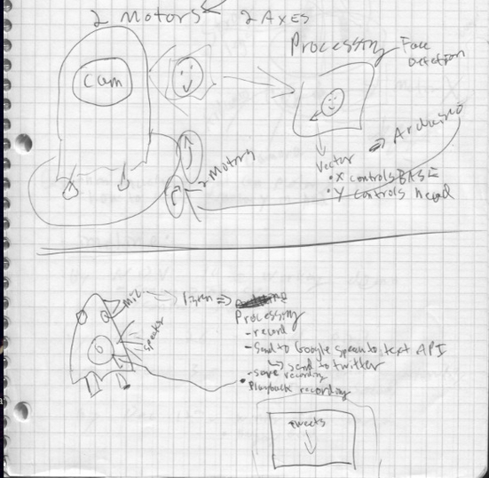
We’ll start off focusing on getting one bird with a camera in its head to rotate so that faces are the centScreen Shot 2013-11-13 at 12.44.09 AMer of its video. This is the first systems diagram I’ve included.

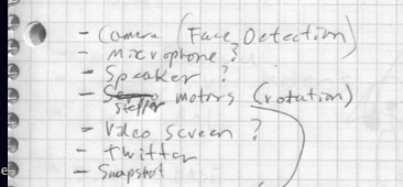
We got a lot of feedback that if we used video, we should complete the feedback loop because people want to see the video. I would prefer to work with sound and use sound to allow people to have a conversation with the Surveillance Bird. The bird would either repeat things it heard when volume was above a certain threshold (like a parrot) or it would say things. We talked about allowing one of us to control the bird but I’m more interested in letting the program dictate the bird’s interactions. If we incorporate sound, this would require installing a speaker and microphone into the bird. It would also be nice to have a third motor tilt the bird’s head while it’s “listening.”

red_lored

If we can get sound working, it would be fun to complete the concept of Surveillance Bird by sending audio snippets to a Speech to Text API, and tweeting the results from @birdveillance. We could then display the text on a screen (perhaps the screen of the computer that we’re using to process the video) or have the bird read the text and add “follow me @birdveillance on twitter.”

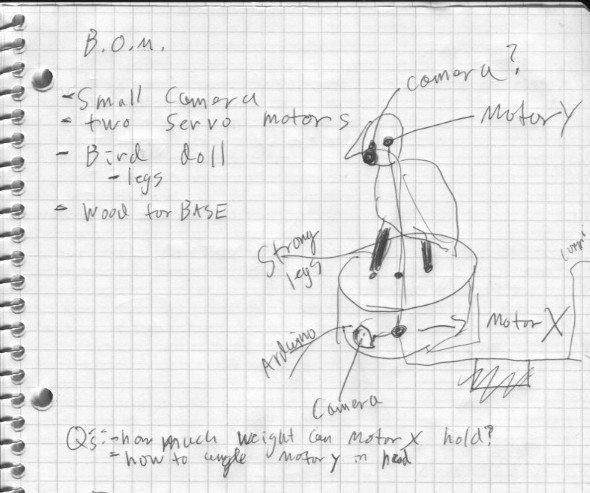
INITIAL BILL OF MATERIALS

pcompFinalSketchingP2

  • Bird Doll
  • Small USB Camera (from ER)
  • Wood for base
  • Two (or three?) servo motors (one of X turn, one for Y tilt, and possibly one more to tilt the head to the side like an inquisitive dog when “listening”) strong enough to rotate camera/bird/base.
  • Maybe foam or something to keep the motors and camera in place?
  • Arduino
  • Computer with Processing OpenCV face detection library
  • Microphone (part of the camera?)
  • Speaker
  • Cables to connect everything

TIMELINE

  • 11/19 – functional prototype that can detect faces and rotate at least on the X axis.
  • 11/26 – tweak the bird’s looks and movement. Create bass and figure out how to hold everything together.
  • 12/2 – add sound elements to complete the surveillance feedback loop.
  • after PComp final, we might continue to tweak and try to install this in a bird-like location during the winter show.


NYC Experience Design: Exchange Place

nycexperience_cover

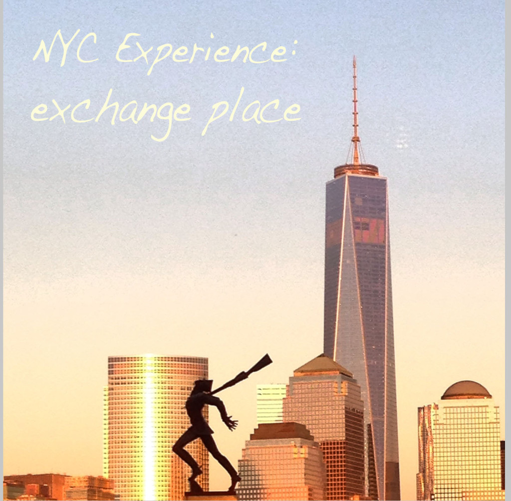
I used to commute to Exchange Place in Jersey City via the PATH Train from World Trade Center. On my commute, I noticed a lot of things, but I was also oblivious to a  lot of things. For example, there’s a ferry just a few blocks from the station, but it five years and a Hurricane before I finally tried this alternate route between WTC and NJ. It changed my whole perspective. I wanted to create an experience that captures this shift. The entire trip takes place in the shadow of the WTC but does not mention 9/11, instead I chose to spotlight memorials to events that may seem out of place.

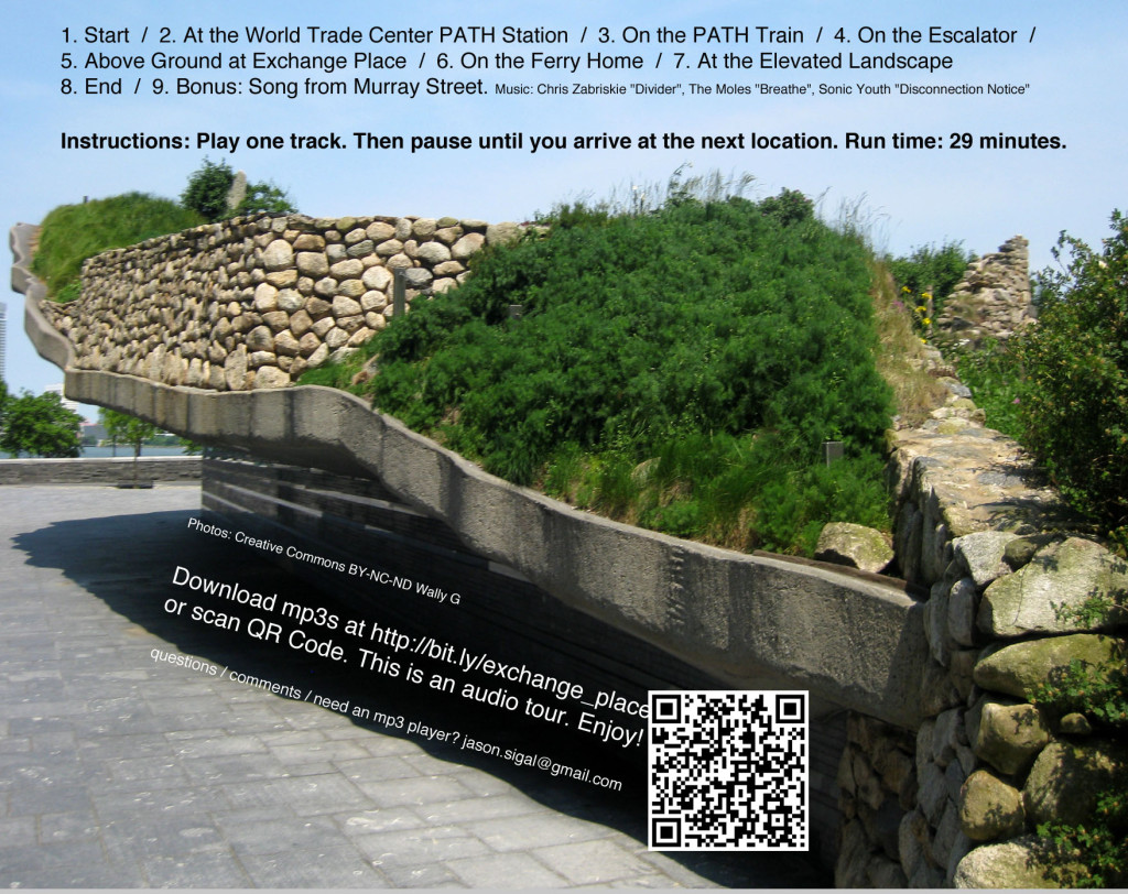
Exchange Place, my NYC Experience Design project, is predominantly an audio tour. I narrated seven tracks in a voice inspired by the impersonal voices that emanate from the PATH station intercom. At the end of each track, the narrator gives directions to the listener who is asked to pause playback until they reach the next point. I started each track with a sound from the PATH and used background music to provide some continuity, but I worry that I did not provide enough continuity as far as the directions go. I also added two tracks of music to listen to at certain points along the journey.

I put my tracks on a CD-R, packaged with photographs of what can be expected on this experience. I also put a sticker on the front of the case to make sure that whoever selected this experience would be able to bring headphones and an mp3 player on their journey. I included mp3s on the cdr and there was also a download link + qr.

You can download the mp3s here and they are each tagged with images of what you would see while listening to them. Here are a few examples

neon_cc-by-genista

Neons for Exchange Place Station by Stephen Antonakos in 1989. Photo Creative Commons Attribution-ShareAlike Genista via flickr.

nycexperience_back

You can download the audio and take the tour yourself here.


ICM Week 2

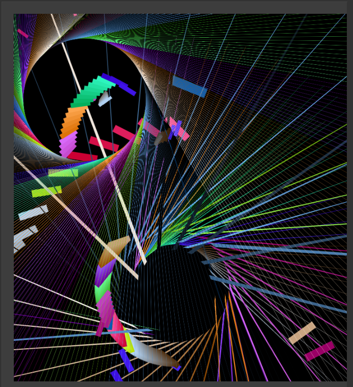
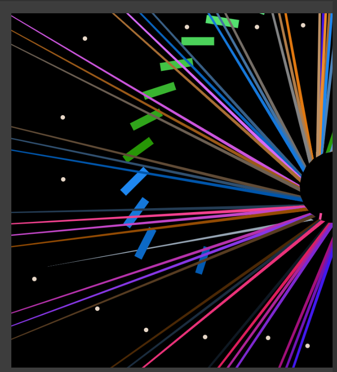
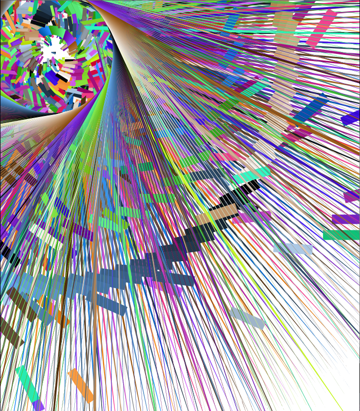
This week, I wanted to experiment with a draw() animation that does something different depending on where your mouse is on the screen. I also just wanted to play with push/pop matrix, combining loops, mapping, variables, and sin/cos. Here’s the result!  browser version | source code

Screen Shot 2013-09-17 at 2.23.26 AM
itp.jasonsigal.cc/icm/week2a/

The interface is not intuitive, but here’s how it works:
– The draw function changes depending on where the mouse is on the screen.
– Clicking on the screen translates the center.
– KeyPressed pauses draw. Another press will clear the screen and change background color.

I didn’t want to add a GUI because I wanted the canvas to be a GUI, but I would like to figure out how I could add a temporary shadow over the part of the screen that the cursor is, which could help provide some feedback to the user.

Some more screenshots:

Screen Shot 2013-09-17 at 2.24.39 AM

Screen Shot 2013-09-13 at 9.23.28 PM