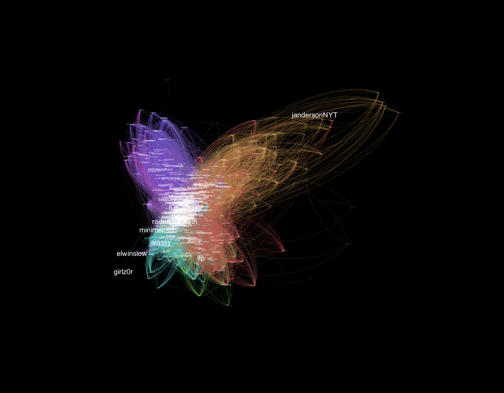
Here’s a visualization of ITP-related twitter data, made with Gephi. It’s an open ord with lots of expansion and a low edge cut, colored according to modularity, with large text for betweenness centrality. I think there is also some Avg Weighted Degree…I’m not sure what all of that means exactly, but I wanted to highlight some unexpected ITP tweeps within sub-groups, and I think that’s sort of what happened. The purple seems to be a cluster of recent grads / current ITP students, green/pink has organizations like ITP and Engadget, green and yellow both highlight people who I don’t know. I haven’t found myself on here yet actually but I will try later!
Here’s a visualization from evolver.fm that caught my eye of how new music introduced on the (now defunct) Turntable.FM would sometimes would go viral:
