Setting my name in Sans Serif
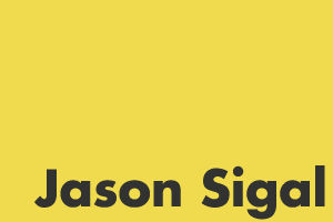
 Futura Bold reminds me of the JavaScript logo, which happens to share my initials.
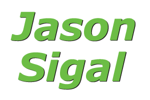
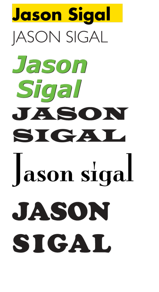
Verdana Bold Italic: I like the unique shape of the J, the symmetry between the I and L which both have ascenders above the cap-height, the high x-height, and the lowercase g descender looks good in the bottom/middle like this.
Verdana makes me think of Green. After making this, I learned that verde/green is part of the typeface’s inspiration, and that it was made my Microsoft. I guess this makes me nostalgic for Windows 95. I also learned that the design world thinks this typeface is boring.
“The Verdana fonts,” Microsoft explains, “are stripped of features redundant when applied to the screen. They exhibit new characteristics, derived from the pixel rather than the pen, the brush or the chisel.” Verdana, designed by Matthew Carter, serves technology not by seeming technological but with its leanness, height and loose spacing; it is bland, but efficient. The Ikea spokeswoman called it “a simple, cost-effective font.” (read more)
Coincidentally, IKEA caused an uproar when they switched their typeface from Futura (above) to Verdana.
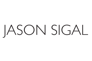
Gill Sans light…looks like a fashion designer logo. I like the descender on the J, and how it compares to the level L making a right angle at the right side. I like the angles and symmetry of A, N, S, I, O, and how the G is not quite an arrow.
Setting my name in Serif
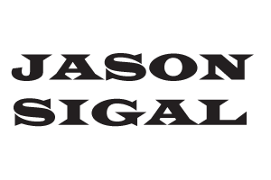
Wide Latin – I like these angled brackets connecting these serifs to their stems. Also, I didn’t have to adjust the kerning to get the words to align!
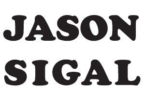
Cooper Black – This feels like a “back to school” typeface with fun, round, slab serifs. I like the stress of the O. To get the two words to align, I adjusted the kerning and fattened the stems of the I and L.
Mona Lisa Solid ITC TT – Not sure where this one came from but it makes me think of classic Hollywood, Manhattan, Paris and film noir. I like the contrast between the low Xheight, and the gigantic giant stems of the J and L as bookends.
Words as Images
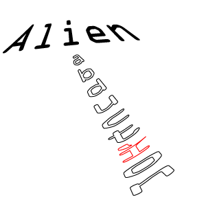 Alien Abduction – OCR A Std, an early computer font. It has some serifs but only to make each letter easily distinguishable via computer screens.
Beer – This is a modified Stone Sans. I hammered the B into a beercan shape (very unlike its original form) and rounded a lot of corners. I gave it a bold weight like a beer belly.
TERMS
- ascender – top. k, l or t – highest point, extends beyond capital NYU
- cap-height: top of caps
- X-height is height of the lowercase x middlebelt, usually about 3/4
- baseline – bottom
- descender
///
- bracket – curved line connecting the serif to the stroke
- crossbar – horizontal stroke on A, H, e, f, t
- stem – vertical stroke
- terminal – non-serif end to a stroke
- counter – curve that embraces an open space (like O or E)
- bowl – open space (within O, a, p)
- shoulder – curved part of the stroke coming out from stem like r bulge
- stress – vertica direction of the curved letters (lines between thinnest points, like on e and o)
- “Old Style” typefaces have a diagonal stress
- ligature – two letters connected together
